Electrecords™ SHOP
by Kliment • Uploaded: Sep. 16 '09

Float
(Floaters:
44 )
Description:
Electrecords online shop.
As seen on:
Electrecords™ SHOP
Status:
Client work
Viewed:
4616
Share:


Lets Discuss
nice colors :)
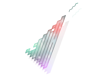
ReplyThis is one of the most unique things I've seen in a while. Very cool use of color and shape. The only part buggin me are those two lighter pink/purple shapes at the wrist. They pop off a bit too much. Great retro feel here.
ReplyCompletely agree with Glen. %5E You could simply remove those shapes of color. I kind of see an E in the negative space to the left of those shapes. If that was your intention, it's clever, but still think this would be more effective without those shapes. Nice work overall.
Replyagree with the above! great feeling about this.
ReplyReally great illustration.
ReplyCrazy color! Very nice!
ReplyYeah! Take a bow!
Replyfirst time viewer, this is awesome. love the colors and style. excellent!
ReplyLooks great Kliment!
ReplyThanks all :) Greatly appreciated!
Replythat small radial gradient in the bg is distracting a bit, otherwise a very interesting piece!
ReplyYes I've fixed that already! %3B)
ReplyGoing straight to my favourites. Execution and colors are so adorable here, damn.
Reply:D
Reply!!nice!
Replygreat work friend, fine fine
ReplyAmazing work!! congratulations
ReplyPlease login/signup to make a comment, registration is easy