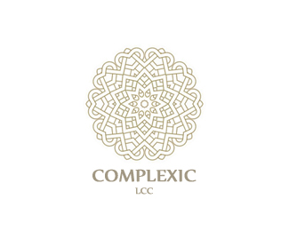
complexic
by mabu • Uploaded: Sep. 12 '09 - Gallerized: Sep. '09
Description:
Financial advisory services. wip.
As seen on:
mabu.dk
Status:
Nothing set
Viewed:
14492
Share:
Lets Discuss
Really interesting icon there mabu!
Replynice, has a very islamic feel to it
ReplyIs beautiful!
Replyi'm completely drawn to the intricacy of the mark...
ReplyComplex...yes it is...perfect:)
ReplyCool. I'm getting more %22Celtic%22 than Islamic.
Replylooks like a nightmare to line up, how did you pull that one off?
ReplyVery nice. I love the layers!
ReplyThanks a lot guys! Hehe true dat Alexander - it was a challenge.
Replymabu!
ReplyThis symbol is so beautiful. The duality of complexity and simplicity is the power of this logo, as I think. Nice work.
ReplyThank you so much. Means a lot to me.
ReplyFits the name, complex, but nice.
Reply@mcguire: Thanks buddy.**@climax: Sorry dude, but I'm not quite sure what you mean. It's late, so maybe it's just me. I can tell you that Complexic has been around since the late 80's, if I recall correctly. I don't think a renaming would be appropriate at this time. Keywords from the brief was complexity, elaborateness and depth. Well that's just some of them. Hope that helps.
ReplyA beauty.
ReplyThanks mate.
ReplyGreat mark!! Suit the name very well. A Complexity beautiful. You must be very good at math :)
Replydas ist fantastish :))
Replynice....elegant :)
ReplyPlease login/signup to make a comment, registration is easy