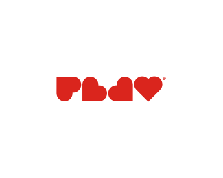
Chunky Burger
by cleos • Uploaded: Sep. 05 '09 - Gallerized: Sep. '09

Float
(Floaters:
52 )
Description:
A logotype for a fast food restaurant.Still in development.
Status:
Client work
Viewed:
12289
Share:


Lets Discuss
Well done, Cleos!
ReplyNice work!
ReplyBeautiful work.
ReplyI like it a lot, great job!
ReplyIt is really nice and I could see working well on all branding items.
ReplyI can just visualize this logo on burger boxes, posters and restaurants. :P **I like it!
ReplySuper nice work, cleos. I love seeing well-done typography like this. I see great branding potential with this.
ReplyLooks great.
ReplyIs this for the restaurant in San Antonio that was on Man vs. Food?
Replythanks guys :), *gregidea - nope :)
ReplyFantastic typo!
Replylovely type treatment
ReplyVery nice logo. But i think that some letters (k %26 r) are too similar, it may interfere to perception.
Replyvery neat execution, good job!
Replyonce again, thanks :)
ReplyGreat custom wordmark, it's obvious you have talent.**Unfortunately it just doesn't say %22Chunky Burger%22. There is nothing really chunky about it. I see flames and a marshmellow like shape in the B.**I wanna see big, fat, barreling, chunky type and then maybe incorporate some flame like feel on the top of the letterforms or done in negative space from the bottom.
ReplyI agree with CT7 you have a lot of talent. The type is great*but it doesn't make me think of burgers
ReplyI think that a logo doesn't work like that. McDonalds don't say anything about burgers and work excellent for crapy burgers that make people going fat. This logo is excellent for a restaurant like this. This will be a great mark.
ReplyI think the logo is excellent. The typography is great. I don't really like how the K and R look the same though. But it's not a huge problem, just annoyes my eyes a little. Overall, great job, and floatered
Replygrat logotype :)
ReplyYeh really great
ReplyPlease login/signup to make a comment, registration is easy