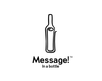
Message! In a bottle
by Type08 • Uploaded: Sep. 03 '09 - Gallerized: Sep. '09

Float
(Floaters:
123 )
Description:
Logo for a client from Vancouver, Canada. They will be launching private label wines from which 50% of the profits will go to the designated charities and will be distributed throughout the province. They also plan to develop few more sub brands and all of those will use the 'message graphic' as the core of every new logo.
Status:
Client work
Viewed:
21219
Share:

Lets Discuss
FRICKEN GREAT! just eliminate that right side flare. FAV!
ReplyThis is fantastic. I agree with Mike on the flare too.
ReplyI like your style, like your moves. Immediately got my attention in the gallery.
ReplyI'm really jealous. Well done buddy :)
ReplyGuys, thanks a lot, you made my evening! :)*Mike and J, the idea was to keep the visual elements opened (bottle in this case) and to create a form that might send out the point of 'continuous efforts': that's why I suggested to use the multicolor lines in application phase (label design, brochures, t shirts, posters, etc) as the secondary graphic elements that will start at that point from the mark...*Lunde and Sean, 1 love! :)
ReplyIMO not needed though and is kinda distracting, as it is already open?? but hey not stepping on toes cause I love it regardless.
ReplyFloated and faved Alen!
ReplyNo probs Mike, I really appreciate your comment. Who knows, maybe we will adjust that a bit, it's still some sort of WIP...*Nima, thanks buddy! :)
ReplyRoy, thanks a lot! WOW! Means a lot my man!
ReplyAwesome idea!
ReplyWell done, Alen!
ReplyPlayed dude
ReplyLovely logo Alen!
ReplyAlex, Vladimir, Gareth, Milosh, thanks a lot my friends!
ReplyVery clever, dude.
ReplyFloated and Faved. This is a jaw dropper bro!!!
ReplyKevin and Fabian, thank you logo masters! :)
ReplyGreat one Alen! congrats.
ReplyThanks, Rudy!
ReplyCongratubottlietion! This is bloody beautiful.
ReplyI love this! Great work Alen :-)
Replyjust great :)
Replygreat one again
ReplyRadek, Sneh, Shylesh, Capota, thanks a lot people! I appreciate it!
ReplyClever idea, well executed, Nice one Alen.*Again showing why you're one of my favourite designers on LP.
Replysweet, nice work lad!
Replygreat logo dude !!
ReplyThierry, Chris, Euan, Mario, thanks a lot guys!
Replynow, this is creative :)
ReplyIndeed lovely mark. Good job!
ReplyRodolfo and Cris, thank you fellaz!
Replystunning work mate
ReplyNicely done! fav
ReplyRich and Srdjan, thank you mates!
ReplySweet:) Good job..
ReplyRoko, Anthony and David, thanks a lot!
ReplyIts great!
ReplyBrilliant, Alan :D
ReplyGreat concept! So simple and laconically!
ReplyI love this one !
ReplyPeter, Siah, Peter and Jovan, thanks a bunch!
Replythe master of blaster strikes again! :P
Replysuch elegance! floated n faved alen! truly awesome!
ReplyThis is great!
ReplyAndreiu, John and Sean, thanks a lot! :)
Replybeautiful! I love the color treatment and simplicity.
Replyyeah really impressed with this one.*simple, but immediately recognizable.
ReplyClever
ReplyVery expressive %0D*illustration, well done.%0D*
ReplyCommunicates effectively, is memorable...nice work.
ReplyAshley, Nathan, Sindur, Sanjay and Jay F, thank you all!
ReplyHaha, I'm really jealous (2). Great logo!
ReplyThanks Alexander! Don't be, just enjoy it! :)
ReplyGreat piece of work there...
ReplyThanks a lot Ranganath! Glad to you see you around here again buddy! :)
Replymuuy bueno! great!
ReplyMuchas gracias, Dado! :)
ReplyThis concept is great. I'm new to LogoPond so tell me if I'm out of line...Please. Being a stickler for clean lines, the thickness in some parts seem to be arbitrary (for example: lower-left of bottle is very different than the bottom-right). If you glance at the logo the bottle is taken over by %22Message.%22 Since the bottle image is strong, would the client have a problem making the bottle slightly larger? If not, bolder colors may bring the type and image together more. The one thing (among others) that is very successful is the use of the darker color on the area of the message in the bottle which puts the emphasis on the letter instead of the bottle. Good work. :%5D
ReplyHello, JLD! To reply on your comment: lines of the mark - I used freehand style on purpose (personal, direct)... Size of the mark - it is really more about the core brand name then the graphic itself (see the description) so I spent most of the time here achieving the balance that would support that... Bright colors used for the mark - purpose of the logo and connection with the charity idea (see the description)... Thanks for stopping by! :)
Replywow. amazing. i agree with removing the flare, unless it becomes more subtle and kind of fades to a soft point. i would also beef up the whole stroke so you can see it better from a distance as well. great work!
Replylove it*
Replyawesome.
ReplyEhsaan, Seb and Konrad, thanks a lot guys! :)
ReplyGreat icon. Really well-conceived.
ReplyThank you, Michael!
ReplyFantastic design and concept. well done
ReplyThanks, Tamarbouta!
ReplyThank you, Paulo!
ReplyGood mark... play a bit with the typo to match the logomark will be additional flair
Replygreat logo!
Reply70th float...good ish
ReplyThanks Felipe and MW86!
ReplyGlad to hear that Joanna, thanks for stopping by!
Replyit's fresh, i like! Floated.
ReplyHey Dan, long time no see! Thanks mate!
ReplyNo worries! mmm yes, i don't frequent this site as much as i'd like, own logo work has been a bit skint of late. Good to see your showcase as impressive as ever though!
ReplyThis is fantastic, Alen :)
Replygreat... wow
ReplyDan, Dalius and Tareq, thanks fellaz!
ReplyI bet this one can join Club 100 by the end of the week too Alen! :)
ReplyYah never know! :)
ReplyI mean no disrespect when I say this, but I have always felt this logo could have been better. I love the mark itself, but I've always hated the colors. The gradients ruin it for me. I think I would MUCH rather see a B%26W version than the way it is now. Again, I mean no disrespect. It's just me personal taste. Has this been used on their website? I would like to see some examples of it being used.
ReplyI'll post b/w version as well. Client still doesn't use this in action but that's up to him and his plan.
Replyexcellent, TypeO8
ReplyThanks a lot, Rajamazing! :)
ReplyStill love this one.
ReplyThank you Mike!
ReplyPowerful work!
Replykiller --- this message in a bottle work ! great !
ReplyGilevad, T%26S, thank you!
ReplyClassic Mr. A
ReplyThank you, Mr.N!
ReplyPlease login/signup to make a comment, registration is easy