Art Hive
by DesignerAG • Uploaded: Sep. 03 '09 - Gallerized: Sep. '09

Float
(Floaters:
95 )
Description:
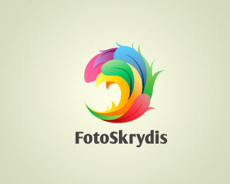
Art Hive. Pencil point. Need your opinions.
Status:
Client work
Viewed:
34406
Share:


Lets Discuss
Looks really cool. I think you need to work a bit on the lighting though - there seems to be light coming from 2 directions - a bit confusing to me?
Reply!mude, thanks for remark and your opinion. Is it better now?
ReplyMe like.
ReplyVery nice.**As far as opinions go - perhaps let the stripes on the back of the pencil surface show through ? Make it a wireframe.
ReplyI can see this making an incredible ice cream cone also. Very eye catching.
Replynice logo
ReplyYes, much better - nice work.
ReplyReally cool.
ReplyReally nice concept!
Replynice...
ReplyVery nice! Dig the concept...dig the mark! (Have you tried it on a lighter ground? Does it work? If you lightened it up a bit maybe you could darken the graphite just a little... Actually it's probably not that color that's throwing me, but rather the type set in that darker shade of grey... Maybe you could lighten the text up instead and see how that plays?)
Replynice concept..nice colors..cheers
Replynice concept!! great work
ReplyI think this is great!
ReplyBeutiful..
ReplyCool, dude.
ReplyAbsolutely agree with michaelspitz! Logo mast be more contrasty to the background, especially the graphite and the text.
Replycool, eye catching as Mike said*
ReplyI think it is interesting... rest of things my friends already suggested.
ReplyNice work, very well solved, My respects.
Replygrazt, you've got yourself a very nice logo there %5E%5E
Replynice puk
Replyyummy i like it!! :)
Replybuenas*me parece que el logo es bastante apropiado para cierta entidad que se dedique al arte*no es ningun cono ni nada por el estilo yo por mi parte veo un lapiz de colores**salu2 desde colombia
ReplyJust a heads up:%0D*http://www.designcrowd.com/design.aspx?designid%3D32419
Reply%5Esigh
ReplyIt's probably the worst copy of an awesome logo I've seen so far....haha.
ReplyDear Matto, Good day, i want to buy the eps original design, is it possible??? please contact me on my email [email protected]
ReplyBeauty!.. I made something similar but not exactly the same.
ReplyThanks again to everyone!%0D*%0D*@mfrank, I agree with you. That copy was really terrible.%0D*%0D*@maalynsalem, I regret to say that it is already in use.
ReplyPlease login/signup to make a comment, registration is easy