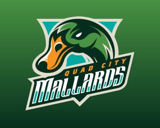
Quad City Mallards 3
by mattkauz • Uploaded: Aug. 25 '09 - Gallerized: Jul. '10

Float
(Floaters:
77 )
Description:
Tertiary Mark.
Logo for IHL hockey club. Voted best identity in the IHL by Hockey News.
Status:
Client work
Viewed:
14091
Share:


Lets Discuss
waoo, really nice illustration, congratitalion, I love it
ReplyThis is genius.
ReplyGood Stuff
Replywe are champions!!! I'm joking... very beautiful your work!!! congratulations
ReplyWow, speachless. Great sports logo.
Replythanks!**
Replynever knew a duck could look so mean, nice job..
ReplyI used to live in the Quad Cities and am familiar with the old look. This new look is fantastic! Are they going to use this look? They would be fools not to.
Replyyep... myqcmallards.com to see for yourself.
ReplyThey all look great matthiason. Well done
ReplyBeautyfull illustration matt!!
Replyawesome illustration!
Replynice duck..
Replyperfect work
ReplyReally admire/inspired by your work! Fantastic!
Replywow.. nice design.. i like the concept
ReplyI can only say ... great work!
Replyexcellent illustration. I like the other versions as well.
ReplySO PRO!
ReplyThis is why Matthiason's is among my favorite galleries.
Replygreat work!*just wondering why you opted to have the duck facing left instead of right?
ReplyPlease login/signup to make a comment, registration is easy