Quad City Mallards 2
by mattkauz • Uploaded: Aug. 25 '09 - Gallerized: Jan. '17

Float
(Floaters:
58 )
Description:
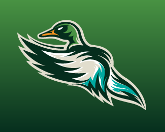
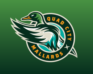
Primary Logo w/text.
Logo for IHL hockey club. Voted best identity in the IHL by Hockey News.
Status:
Client work
Viewed:
8597
Share:


Lets Discuss
I love your technique, and the use of colors, congratulation again
Replyawesome!
ReplyKeep it up, love seeing them.
ReplyGood as always!
ReplyHot damn, these are great!
ReplyWow, that's skill again. In your face nice :)
ReplyLoved your style of illustration...very nice...
ReplyFascinating...
ReplyThis is a cracker! I didn't realise a mallard could look so strong and aggressive %3B )
Replythank you!
ReplyVERY sweet! I would be a fan of this team. Love it!
ReplyIf i ever start a sport club of sorts i would definitely know who to look for logo design... some serious talent here...
ReplyWow dude, I am LOVING your sports logos!
ReplyJealous.
Replyand I can see why it was voted the best, excellent piece of logo design work.
Replyyour illustrations are so good!
ReplyGreat work Matt! I can't understand why this isn't in the gallery.
ReplyFirst of GREAT color selection. The mark itself is magnificent.
Reply@levelb now it is :D
ReplyI love it *o*
ReplyPlease login/signup to make a comment, registration is easy