Palette Wine Bar logo
by muse7 • Uploaded: Aug. 23 '09 - Gallerized: Jul. '12

Float
(Floaters:
28 )
Description:
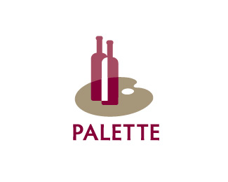
Palette Wine Bar - is a logo for a sophisticated wine bar and/or restaurant that's niche is pairing wine with food. The mark plays on the idea of inventive pairings serving wine bottles on an artists palette / tray and connecting art, cuisine and wine.
Status:
Just for fun
Viewed:
7719
Share:


Lets Discuss
Or maybe it stays white...but the red bottle hue changes where it overlaps the pallet?
ReplyVery nice made!
Replylogoboom - da boom! - ok I see the light (through the glass)*tass - thank you very much.
ReplyYeah...that's nice.
Replynice one muse
ReplyThanks itsgareth and logoboom, I submitted it to Brandstack and they put it in the critique section, so fellow logoponders could you give me your thoughts because I am quite perplexed and slightly frustrated.
ReplyBTW this spelling of palate refers to the mouth and taste. The paint board is spelled palette.**I'd go with all caps as well...just to give it a more solid foundation for the mark to sit on.
ReplyThank you for responding to my request da bomb! True logoboom, I switched it to palate because it speaks to the sense of taste, wine and cuisine (a refined palate). Do you think that I am expecting to much from a viewer to make the associations between the words palate and palette? I'll play with the type. *
ReplyLovely design. Only the white bottle overlapping area catches attention too much. Maybe slightly rosy tone would bring more solid feeling for whole logo.
ReplyPlease login/signup to make a comment, registration is easy