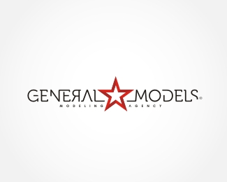
General Models 2
by s@ky • Uploaded: Aug. 22 '09 - Gallerized: Aug. '09

Float
(Floaters:
19 )
Description:
Modeling agency based in Moscow, Russia.
Status:
Unused proposal
Viewed:
12156
Share:


Lets Discuss
i like this one better
ReplyI like it. Not sure it needs the backwards R.
Replythe mark looks kwell....but am not sure wot the mark's gotto do with models though
ReplyI get it. The marks refers to general stars n stripes. Doesn't need the backward R tho.
ReplyThanks :)%0D*He he, the backwards R represents at the same time russian letter BF (ja, ya...). Anyway thanks again.
Reply%25u042F - hm... copy/paste error :)%0D*%0D*http://en.wikipedia.org/wiki/Russian_alphabet
ReplyFeatured in GALLERY not a suprise!
Replythis is the best version of the mark for sure. I think that because there is a significant amount of movement in the mark, the backwards R just detracts from the whole piece. (Even with the explanation about the Russian character)*Less is more. Also, better to have type consistency (e.g., the A has no cross hatch in it, but the E's do...inconsistent detail). **Over all though, I like the direction you're heading in with this.
Replyreally nice!
ReplyGood concept, nice execution, and very strong logo. This is a logo for an elite agency. The %22r%22 doesn't fit. But in general this logo is just great.
ReplyPlease login/signup to make a comment, registration is easy