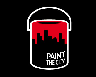
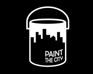
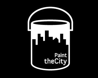
Paint the city...
by HitByReindeer • Uploaded: Aug. 12 '09

Float
(Floaters:
18 )
Description:
for fun... T_T
(c) Rodolfo Carrillo
Status:
Just for fun
Viewed:
5364
Share:


Lets Discuss
*made drippi-er :P**removed white outline and handle**unfortunately, the word %22city%22 will have to remain this way for now since I stupidly made it outline from the start :(**thanks everybody for your feedback... i'm officially giving it a rest.
Reply:P OUCH! We've all been there. I love that you fessed up to it though - made me laugh. I've appreciated your feedback as well!
ReplyBest yet!
ReplyOh and Muse7's comments on the other post are great. Paint the Town (red) makes for an even more clever visual pun.
Replybest yet although the paint on the tin is extending out a bit too much
ReplyBINGO!!!!!
ReplyDefinitely bingo.
ReplyReally cool evolution of the idea. The final step would be to do geometrically accurate mapping of the city outline texture onto a 3D paint can. _That_ would turn it into a well-executed logo.
ReplyYes, paint the town red! This is looking great.
ReplyYep, that's it! Another confirmation of Logopond's power! %3B)
Replythanks for commenting, guys!**@muse7, logoboom, chirp: i'll change the text to town and upload soon!**@dbunk: thanks for the intake :)**@j-caz and momentummagazine: glad you approve! **@epsilon: OH SNAP! :D jk, I know your suggestion would make it look real perfect, any suggestions on how to achieve the geometrical accuracy on AI? because so far I've been using %22free distort%22 effect and i gotta tell you it ain't pretty! :P**@type08: yes, my friend, Logopond's super power is undenniable!
ReplyThey are all good. I can't decide. I think the paint blobs on ground are overbaord myself and liked the handle. But it's your deal now and I bet it's been overwhelming hearing everyone's suggestions. Go with your gut it's a fricken fantastic design.
ReplyDef favoring one of them???
Replythank you so much, logomotive, for your kind words, as I already said, you are truly an inspiration, and hearing you like what I've done here makes me think I must be doing something right, it's a great encouragement for a strarting designer such as myself.**Yes, it was utterly overwhelming to try and incorporate everyone's feedback, but I'm glad I could receive great advice from such experienced, talented designers, this has been an amazing learnig experience.**thanks all! :)
ReplyVery cool...I'm just wondering what it would look like with the black removed. Would a negtive image of the city work?
Replyhahahah just when I thought i was done with this, I find myself intrigued by your comment, brandsimplicity, and voil%E0: **http://logopond.com/gallery/detail/74288
ReplyPlease login/signup to make a comment, registration is easy