Ann
by OcularInk • Uploaded: Feb. 09 '07 - Gallerized: Feb. '07

Float
(Floaters:
198 )
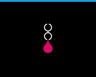
Description:
This is an ambigram of my wife's middle name. This is her logo. It can be read the same if flipped upside down. // Featured in Los Logos 4
Status:
Client work
Viewed:
64459
Share:


Lets Discuss
Thanks for your compliment and I really admire your work! And specially this one in particular...great logo!%0D*%0D*%0D*%0D*
ReplyAnytime, Ghiath. The compliments are well deserved. And I am truly humbled by yours. :-)
Replyive seen this one so many times but it takes like forever to scroll down here...%26 then you realise that its all been said before! so heres my attempt at saying something that hasnt yet been said...**f-ANNA-tastic!!!
Replyor...**f-ANN-tastic!**...both%3B)
ReplyLOL!! I like the 'f-ANN-tastic!' Thanks, mate. And quit being so lazy!!
Replythis is repetitive, but here it goes again: Great logo! wonderful use of typography.
ReplyThank-you! You have some nice logos yourself.
ReplyVery nice!
ReplyThank-you!!
ReplyBrilliant! Bravo!
ReplyWow! Nice ying-yang style
ReplyVery minimalist. Love it.
ReplySencillo y muy delicado.
Replylovely!!
ReplyGreat one.
Replygotta love the ambigram.. just finding (and/or recognising) the ever elusive word or name that lends itself to this treatment is difficult enough.. well executed.. nice work
Replyreally minimalistic!
ReplyFew marks create as much presence as ambigrams do. And you definitely did a great job. Your lady should be pleased!*How large will the tattoo be? Though I don't have any myself, a friend of mine is heavily into the stuff - as I understand thin lines are hard to achieve (in this case I would imagine they may pose a problem for those connecting the letters?)
ReplyWow! Many thanks to you all!**@ sans : Excellent point, my friend. The tattoo won't be any smaller than what's here. Having many tattoos myself, I was very aware of the line weight. The thinnest lines on the ambigram will tattoo just fine. :-) However, I appreciate your concern. P.S. I saw the one logo you uploaded. Very nice typography. I'm looking forward to seeing more.
Replyvery interesting decision
ReplyHarmony, rythm %26 symmetry - everything is here.
ReplyDo I need to repeat what all these people have been saying? I think I will :)*Amazing ambigram...Beautifully executed!
ReplyThanks LOGOPED, Logo Diver, and influxes!!
Replythis is very interesting logo...
ReplyI am new here, and I don't know English very vell. How I can send my logo here, in this site?
ReplyI love how at first glance it isn't made obvious that its an ambigram. great work.
Replyvery nice%7E
Replythis is a good one! :D great!
Replyvery very nice
ReplyIt reminds me Angels and Daemons book by Dan Brown where I read first time about ambigrams. I find it very very hard to execute it into graphics. I admire this work very much. Its very attractive and special. Congratulations to the brilliant job.
ReplyGreat! Inspiring.
ReplyThanks, everyone for taking the time to comment on my work. It means more than you know.
Replysmart as it gets... incredible
ReplyThanks halles and Houston-we.
ReplyWhoa. Slickness.
ReplyI love ambigrams.... adding as favorit
ReplyThis looks really good in the Los Logos 4 book:) congrats dude:)
Reply@ illusio : Thanks chuk.*@ sebastiany : Thanks sebastian.*@ actiondesigner : Thanks action. Lookin' forward to receiving my free copy in the mail. :-D
ReplyCongrats Kevin. Well deserved!
ReplyThanks Roy. :-D
Replythis cool... the font is great
ReplyThanks Tareq.
Replywow very nice, i dont know how i never saw this, great job kevin
ReplyWow. So simple.
ReplyAlways meant to comment on this, what I love about it so much is that its not immediately apparent that its an ambigram. The name 'ann' is just so legible, this is really special.
Reply@penflare, @epsilon, @NeilMcDonald // Thanks friends!
ReplyWTF? I thought I gave my vote before... Anyway, 101! Well done, Kevin!
ReplyThis is one of the classics. I guess its beautiful cause it doesnt look like an ambigram at the first glance, so clear and clean. Grats !
ReplyThanks Dalius, Alen and Sindur. :-D
ReplyI have always admired this one Kev...
ReplyThanks B!
ReplyThanks Shaun!
ReplyFantastic!..
ReplyThanks Petro!
ReplyCan't beleive I haven't run into this before... Really is a killer mark! :)
ReplyAWESOME!
ReplyThanks michael and Antonio. Only 7 more floats to go and it'll be in the most floated category. Let's see some more love. Do I sound too desperate? Hahahaha!!
ReplyThanks for the recent floats, peeps.
Replythere's another one for you! can't believe i haven't floated this one already
ReplyHaha, cheers Niall.
ReplyThanks Marcos!!! :-)
ReplyMelissa is getting her tattoo today. I'll post up pics soon. Yay!!
Replywoah%5E that's great%3D)
ReplyThanks Kirill. I'm very excited for her. :-)
ReplyHow did the tat turn out then? You promised pics!! %3B))
ReplyHaha!! Thanks for checking in, Neil. The tat is still healing. I'll probably post the pics after Christmas. :-) Take it easy, bud.
ReplyHey people, check out what our friend Kevin has to say about ambigram and this logo he made: http://blog.creativityden.com/25-creative-logos-of-the-week/*New article and interview on the facelifted Creativity Den blog.
ReplyThanks for the interview, man. Very glad I could help. Take it easy!
ReplyThank you, Kevin! Very nice read!
ReplyI haven't said that before, but I love this one Kevin.
Reply...a bit fixed article now, it had a few mistakes in it http://blog.creativityden.com/25-creative-logos-of-the-week/
ReplyCheers, Alen. I'm glad you like it. Thanks, milou! Always great to hear from you.
ReplyOne of the few successful ambigrams I've seen.
ReplyThanks, Jerron. Very happy to have your approval. %3D%5ED
ReplyGreat ambigram and great piece for a tattoo!
ReplyThanks a bunch, Claude.
Replybeautiful.
ReplyNever commented, but definitely one of my all time favs Kev. Could stare at it all day :)
ReplyThanks yelds. Much appreciated. Joe, thanks dude! Means so much to me.
ReplyGood stuff Kevin. .. just as what one can expect from you!
ReplyThanks, Ali.
Replyin my favs for a long time, forgot to float it though, love this, outstanding work
Replythis is really nice. great work!
ReplyFlorin and Nickolas, thanks to both of you!
ReplySImple and elegant. Well done.
ReplyThanks again, dude!
ReplyYour wife has the best logo in the world Kevin! It's a real gem.
ReplyAwe, thanks. She'll be happy to hear that. :-)
ReplyHey! So nice to finally know the author of this logo! Is one of my favourite logos ever, congratulations!!!
ReplyThanks again, Isis!
ReplyPlease login/signup to make a comment, registration is easy