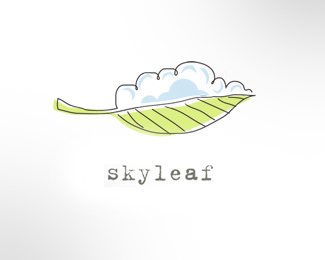
SkyLeaf
by LloydCreative • Uploaded: Jul. 31 '09 - Gallerized: Nov. '09

Description:
Logo design for proposed new wine brand.
Status:
Unused proposal
Viewed:
21170
Share:


Lets Discuss
BigAl67, love the style and the cloud scene is beautiful! Not quite sold on the font though.
ReplyHey Georg - quick response from you... thanks for looking in and for the float / comment. Appreciate your opinion on the font... this is a bit of a w.i.p. but thought the imperfect, ragged typewriter font suited the dreamlike, naive style of the concept.
ReplyNice mark, Big Al. Perhaps you just need to reduce the size of the font. I think this will balance out the design a little more. Right now, the font just seems to jump out at you first. I think it has something to do with visual weight it is carrying. By reducing the size of the font, you'll probably have a better balance. Your thoughts?
ReplyHey Kevin - thanks for the comment. You have a great eye for detail - will look at font size when I get a mo.
ReplyLove the illustration Alex.
ReplyDanny and Chris - thanks for the comments and floats.
ReplyBeautyfull tasty brand, You have great style.
Replywow..this is phenomenal...love this.
Replyhow about making the outline and text color the same?
ReplyVery nice style!
ReplyLove the mark but I agree about the font. Typewriter mechanical feel doesn't jive with the hand feel of the mark IMO. A beauty though.
ReplyThe mark looks great - very nice colors
ReplyMuito bonita esta ilustra%E7%E3o
ReplyVery nice style BigAl! Like it very much...
ReplyLove it. Just feels so light and airey...great stuff!
Replyvery nice, love that style
Replyvery nice :)*congrats!
ReplyThanks for the comments - really appreciate the gallery placement, your floats and the feedback.
ReplyNot a bad design, but I'm always a stickler for staying away from IP (intellectual property). Especially when it's a big entity like the EPA: http://www.epa.gov/smartway/vehicles/smartway_images/smartway_vehicles_logo.gif My company has been a SmartWay member for over a year now (and they've been around since 2004), and you posted this logo on July 31st 2009, so I'd venture to say that the original idea was theirs. Please be careful - IP can be sticky and come back to haunt you if you use infringing pieces in your portfolio.
ReplyThat's quite an allegation, JC. These are two very different images you are comparing.
ReplyNot an allegation in any way, Kevin. I'm not saying that Alex has ever seen the SmartWay logo before - just that they had the design idea before Alex did, and that the allegation could be made. True, the logos LOOK different, but the concept has very similar intellectual property - a leaf, with one side being a cloud, and the other land. I'm simply calling attention to the similarity for the benefit (and caution) of Alex. Sorry if it seemed that I was implying something shady on his part.
ReplyThanks for further explaining, JC. Just one Logoponder looking out for the other in both instances. :-)
ReplyHey - thanks for looking in guys... interesting comparison you make Pixel, and I take your point, but I guess it reinforces my belief that there's very little new under the sun and when a client gives you a name like Skyleaf - well, the above result is hardly a surprise. Incidentally, I'd never heard of Smartway before today so I guess ya learn something everyday. I guess stylistically there's a world of difference and the fact that the leaf part of mine actually doubles as rows of vines adds another important difference. Thanks for stepping in too Kevin - nice to know others on the pond know an original idea when they see it. Which begs the question%3B if you create something as an original design with no outside influences other than your own creativity that resembles another person's earlier creative effort, is the second idea any less original? If we were to guarantee that anything we designed had not been seen in some way, shape or form at anytime throughout history my guess is that the Pond would look a tad empty.
Replythis is gorgeous! love it
ReplyI'm going to think this debate over whilst listening to the acoustic version of Lady Gaga's %22Poker Face%22 - I'll let you know how it turns out.
ReplyDoesn't it also depend on what industry the logo is representing? In this case these are two very different industries. Could this even become an issue legally?
ReplyThis is very charming and I love the handmade look. The only critique I have is that the type and the leaf look a bit disconnected.
Replyreally nice illustration, that other logo doesnt even compare*bit insulting the way he went about saying that!
ReplyThere's a nice refreshing feeling to this, good job.
ReplyThanks for your continuing kind comments people... really appreciate y'all looking in and floating the work.
Replyi absolutely love the creativity and most of all simplicity! i'm looking to have a logo made - how can i contact you for a quote?
Replysdesign... thanks for the kind words. If you go to www.lloydsgraphicdesign.wordpress.com you can see some other work and if you're interested, make contact from there. Bye for now.
ReplyPlease login/signup to make a comment, registration is easy