makalu
by nido • Uploaded: Jul. 29 '09 - Gallerized: Aug. '10

Float
(Floaters:
91 )
Description:
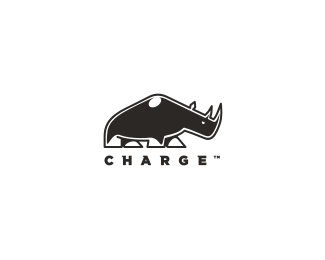
final... for a product design company... the companies name is makalu & the solution we settled with was an ibex... an animal "designed" for mountains (makalu is a mountain, 5th highest in the world)... and added extra long horns for the "creative" aspect.
As seen on:
makalu
Status:
Nothing set
Viewed:
14420
Share:


Lets Discuss
Awesome result!
Replylove it nido, nice job!
Replythanks fellas...**@Houston... that's cool... what would you suggest?
Replylove it :)
Replyvery well styled
Replythis is lovely! :)
Replyvery good, has a bit of that elefruit esk feel, nice job
Replyyou guys are too kind...**@penflare.. hah... maybe I can start a collection...
ReplyMuch Improvement Nav. Kudos.
ReplyWell done.
Replycheers Mike %26 George...
Replygreat !
Replynido to say... excellent!
ReplyThis is fan-flippin'-tastic!! I absolutely, positively, tremendously love it.
Replyhaha... Rekhmet guys... Rekhmet...*
ReplyGreat stuff
Replythanks cerise...
ReplyFun!tastic
Reply@Houston... haha thanks... %26 good question!**@Muamer... thanks.. how you been aki?
ReplyLove it man
Replycheers felro...
Replyinspiring! execution is top notch. The font and mark match up so well and your kerning spot on. Seriously sick! - floated
ReplyExcellent logo my friend.
Replythank you very much... :)
ReplyTurned out nice, man.
Replycheers Kevin... can I call you Kevin?... Kev?.. K?...
Replynice to see this in the gallery. great style.
Replylove the mark, not the type my friend
Replyi want one...
Replysimple and beautiful
Replywow...love this illo nido
Replytype fits it beautifully!
ReplyThat's cool, mate
Replythanks guys... a colour version can be seen %22here%22:http://cache2.allpostersimages.com/LRG/29/2906/VXUPD00Z.jpg %3C%3Cclick...
Replycheck out the voyeur on the right though... curious much....
ReplyCool mark nido! Awesome work..
Replycolor version is better though
Replythanks...the client wouldnt go with the colour version.. never could figure out why though...
ReplyGreat mark nido! I know this says final, but I almost want to see the tail curved out a bit more to create a nice %22m%22 in the negative space below. Absolutely great work here with the type too.
Replyso funny and cute!
Replythat color version is really difficult to do while standing on a ledge, one bump to hard and could be a problem, kudos!
ReplyNav is always the Black sheep anyhow.
Replywhy I like him.
Replysimple and beautiful!
ReplyI loved the illustration but the rationale makes this one a real winner in my eyes. Fantastic!
Replynice!
Replytruly nice work man, %22clapping%22***CHEERS
Replythanks fellas... so much attention for one goat...
Reply%5EYes, men like to stare at goats.
Replywow!
ReplyPlease login/signup to make a comment, registration is easy