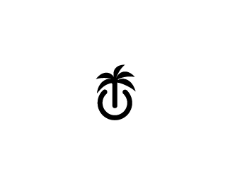
BeachGeek - "PowerPalm"
by JWG • Uploaded: Jul. 24 '09

Float
(Floaters:
15 )
Description:
Logo for BeachGeek, a small business and residential IT company who's services an upscale area near the beach.
The font is a modified "Walkway Rounded"
Status:
Client work
Viewed:
1799
Share:


Lets Discuss
Font goes well with this ingenious design, imo. Though, I'm not sure where you're going with the 'e' shortened like it is. :) Love that logomark! Good to see it with text.
ReplyThanks! I just chopped the %22e%22 because when the type is reduced, the tail would be too close to the middle part of the letter, essentially, closing the gap. Now that I look at it, the %22G%22 is having a gap issue as well. I should chop that back a little. Thoughts?
ReplyI wouldn't chop the G. I think that the horizontal line makes it apparent that it is a G, and it looks good!
ReplyPlease login/signup to make a comment, registration is easy