fly
by HitByReindeer • Uploaded: Jul. 20 '09

Float
(Floaters:
22 )
Description:
just an idea :)
(c) Rodolfo Carrillo
Status:
Just for fun
Viewed:
11475
Share:


Lets Discuss
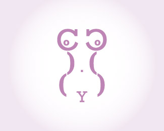
Great idea! Just try to slim down the curls on the %22Y%22 to make it more clear.
ReplyThis is officially awesome -Siah
Replygracias! tratar%E9 con tu sugerencia :D
ReplyWOW thank you siah, really appreciate it!
ReplyGreat idea! I like it the way it is, but just curious, did you try a dashed line for the 'L' and 'Y' letters?
Replythanks ocularink! and no, I didn't but i'll do it right away, thanks for the suggestion :)
ReplyGOOD CALL OC! The update is much much stronger.
ReplyFly High!
Replythanks for the comment dbunk :)**@logoboom: definately a brilliant observation from ocularink, i'm so glad i followed it :D, thanks fot your comment
ReplyLove the white fill style! Great execution! :)
Replythanks a lot for the comment michael :)
ReplyThis is cool.
Replythanks firebrand :)
ReplyAgree with everyone else here%3B this is clever and very likable.
ReplyI'm very grateful for the support on this piece in particular, and how it turned out!, thanks JF for all your feedback my mind is racing with ideas thanks to you haha, cheers mate!
ReplyVery innovative. great
Replysorry:)
ReplyThanks a lot, Marko!!
ReplyWhat's up Sergey? Partying hard mate? :)
ReplyPlease login/signup to make a comment, registration is easy