BAMA
by JMC • Uploaded: Jul. 17 '09 - Gallerized: Jul. '09

Float
(Floaters:
17 )
Description:
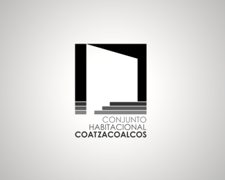
Throughout more than 15 years, this important building firm has strengthened its career in the construction field. The funky & cross dimensional image for its.recently inaugurated design division, expresses the fresh new view of this company for its future projects.
2009 © José Manuel Contreras
Status:
Client work
Viewed:
14371
Share:


Lets Discuss
For some reason I like the funkiness of what's going on with this. However I think the letter shapes themselves are not very aesthetically pleasing and I'd use simple black type. But I do like the quirkiness of the mark.
ReplyNice IDEA! Needs a little something... I dunno what that something is tho! %3B)
ReplyThank you very much logoboom %26 Mason Roberts for your comments and feedback.
ReplySmart concept
ReplyThank you very much tass.
ReplyFantastic! Great concept! I like this logo so match!
Replylove the cross dimensional work here, niceee!
ReplyI like this a lot, more so than 70%25 of the other logos on this site. This is creative and different, and to me fits the subject matter. So many logos on this site, take the name of the company (or a made up one) and do the obvious with it.
Replynice and a bit illusional
ReplyThank you very much for all your comments.
ReplyPlease login/signup to make a comment, registration is easy