phc '09
by mirda • Uploaded: Jul. 08 '09 - Gallerized: Jul. '09

Float
(Floaters:
43 )
Description:
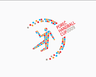
Logo for "Porec Handball Cup 2009" in Croatia.
They call Porec "city of mosaics" which explains the use of mosaic in logo. My english - bad, sorry!
Status:
Client work
Viewed:
8505
Share:


Lets Discuss
I love the colors mirda. My only thing is maybe make the ball in the guy's hand more recognizable?
ReplyMaybe you're right, I'll try to do that. Thanks!*
ReplyHas a nice European feel to it, nice one
Replyyeahhh is very nice!!
ReplyI really like this... very original and inspiring! Good work
ReplyThanks guys!
ReplyVery nice work - good idea to reference the mosaics.
Replythis is beautiful, very unique..well done!
ReplyThank you guys, that means so much to me.
ReplyI've been to Porec once! Beautiful beaches! Nice logo.
Replynice job mate :)
Replygreat, i love it. Your English 're not bad :D
ReplyNice, I like typographic part as well.
ReplyThanks you oski, thank you huyendesigner!
ReplyPlease login/signup to make a comment, registration is easy