Pediatric Dentistry
by bartodell • Uploaded: Jul. 06 '09 - Gallerized: Jul. '09

Float
(Floaters:
24 )
Description:
Logo for a local pediatric dentist. Trying to play off of child's perspective.
Status:
Client work
Viewed:
14392
Share:


Lets Discuss
I like the mark! It definitely appeals to children.
ReplyAnother great mark from a Master of our trade.
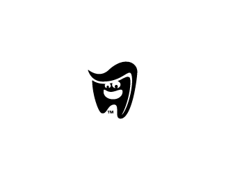
ReplyReally nice mark, but the placement of the TM bugs me a little..
Replynice:) agree about the TM
Replysuper mint!!!
ReplyI agree with dimARTirosov. 'TM' as is tickle a tooth :-)%0D*But logo looks great anyway!
ReplyLove the character here, pretty clever touch to use the toothpaste for the hair :D **Agree with the people above, the %22TM%22 is the only thing that bugs me.
ReplyAll I see is an extracted tooth which just reminds me of why I HATE the dentist and why I am scared to go to one. Even with the smiley face %26 hair, it's not fooling me...
ReplyThe subject and content were just great. I think that your insight is deep, its just well thought out and really happy to see someone who knows how to put these thoughts down so well.*%3Ca href%3D%22http://www.pacificsteamclean.com%22%3Esan diego carpet cleaners%3C/a%3E
ReplyPlease login/signup to make a comment, registration is easy