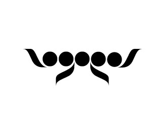
Circus of Magazines
by logotomy • Uploaded: Jul. 06 '09 - Gallerized: Jul. '09

Float
(Floaters:
116 )
Description:
Logo for an upcoming website marketplace for magazines.
WIP
As seen on:
Olivier Courbet
Status:
Client work
Viewed:
31076
Share:


Lets Discuss
i'll post the colored version soon.
Replynice idea logotomy:) maybe it would look better with the two text lines aligned
Replythanks dotflo. It is still in progress so i am tweaking it up %3B)
Replyfantastic logotomy...
Replythanks John
ReplyNot bad at all, cool idea!
ReplyVery clever,nicely done.
ReplyBrilliant execution !
Replythank you guys :)
ReplyBrilliant!
ReplyThis one must have gotten lost in a flood of bad logos uploaded to the pond, cause' I don't remember it. Very nice concept!!
ReplyGenius!
ReplyThis one is ingenious! Great font too!
Reply%5Ewhatever they all said, Ditto.
Reply@Ocularink: You're not wrong there!
ReplyThe beauty of simplicity..I wouldn’t even bother making a coloured version of this, you’ve nailed it. :)
ReplyVery nice work, logotomy.
Reply@firebrand: Haha, it's been pretty bad lately. Where did all the talent go?
ReplyDiggin it!
ReplyWhat can i say?... this is beautiful!
Replyvery nice work
ReplyGreat!
Replyamazing, very nice work! An upcoming wolda winner!
Replysuper. que buen hallazgo!
Replyvery nice! I love how you have given fluid motion to the pages/magazines :-)
Replyso smart!!
ReplyFabulous concept, brilliant execution. One of the best I've seen lately.
Replygreat idea! :)
ReplyThanks everybody!
ReplyNice execution.
ReplyGreat!%0D*
Replygreat work! it's just perfect!
Replyawesome
ReplyLove it! Great concept!
ReplyI was astounded to realize that its a circus tent formed with papers. that's a great logo and very efficiently executed idea.
Replybeautiful
ReplyThat's great!
ReplyThat's beautiful! Clever thinking :)
Replygreat, looking forward the color variation.
ReplyVery nice. Great job.
ReplyHow did that happen? I made the above comment haha
ReplyPerfect bro, just simply perfect :)
ReplyThis is great, nice job!
Replyit's logos like this that keep me coming back here to logopond. :) hopefully, my work will one day make an impact like this one does. thanks for inspring me, logotomy!!
ReplySimplicity at its finest! :)
ReplyThanks Guys, means a lot to me.
ReplyLooking good.*May I suggest a ball at the top center.*Also, %22of%22 is not resting comfortably there since it doesn't*relate to Circus, rather to Magazines.**Either a one liner or something creative with %22of%22 on three lines.
ReplyWow, with the title of %22Circus of Magazines%22 to work with, you did a fantastic job. It had a lot of cheese potential, which you negotiated very well.
ReplyPerfect in red colour!
Replyrealy like it!*nice graphic and typography!
Replywow!!! great concept, and style as well.
Replycongratulations on wolda
ReplyThank you Milash!
ReplyAnd thanks to Davy Dooms for his comment. I entered the competition after reading it :)
Replyomg, congrats on wolda and the mediabistro logoawards!! :D
Replyhaha, indeed. I don't remember I said that...*So deserved.
ReplyPlease login/signup to make a comment, registration is easy