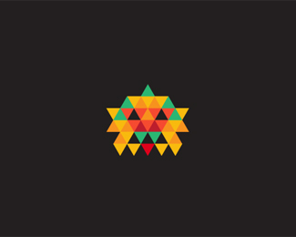
Expo 2012
by milash • Uploaded: Jul. 04 '09 - Gallerized: Jul. '09

Float
(Floaters:
138 )
Description:
This logo will work well for various exposition branding
Status:
Unused proposal
Viewed:
32819
Share:
Lets Discuss
Fireworks! :)
Replyeverybody loves fireworks
Replywoahowow !
ReplyReally like the concept and the many dimensions it explores :)
ReplyLove it, once again.
ReplyVery light and attractive. I like it a lot.
Replygreat, milash you are from Georgia?
Replythank you guys.**yes i am from georgia
Replyheh eseigi qartveli yofilxar %3D%5D%5D
Replylove it dude, nice work there Milash :)***CHEERS
Replystill like that black and white version a tiny bit more than this one :) the fireworks really looks fantastic!
Replyyee, everybody loves fireworks, so me too!
Replyyep..nice work
ReplyJust curious, y 2012? is it because its the worlds gonna end after that :I
ReplyNice! Very fresh!
ReplyAwesome mate.
ReplyGreat fireworks!
ReplyPow! nice work
Replythanks guys. people might end by 2021, world will live on without us just fine.
Replyloved it on brandstack...this is brilliant stuff mate!
ReplyGreat execution!
Replyvery beautiful milash!
ReplyExplosive! Great work.
Replymaybe try a blue, green, yellow color scheme. that would be interesting.*very nice work
Replymind blowing expo ...awesome
ReplySo good !
Replywow great
ReplyAnd how do you do that ?
ReplyBeautifully done.
Replyyes, beautiful dimensions. hope you sell it!
Replywow! very good 1
ReplyCool one!
ReplyBrilliant!
ReplyVery nice Milash! great colors and execution.
Replywonderful!
Replythank you all
ReplyWOW! Great.
Replymilash, very nice logo. How can I contact you? I noticed you have this for sale and I was interested in knowing the cost. Thank you.
Replymy e-mail is [email protected]
ReplyHello my friend! I have featured your logo (amongst others) in my new article on logo inspiration at Creativity Den site: blog.creativityden.com/author/type08/*This is probably my last article there since the site is going through major reorganization so feel free to visit it and enjoy it! Thanks! *Type08
ReplyWell, not quite the last one!*WE HAVE A TOP3 FEATURED LOGOS THERE ON THE POLE NOW!*And all logos are from the best logo site ever, Logo Pond, so you all know them really good and you're all invited! Have fun!*Type08
ReplyOOOpppsss, here's the link:*http://blog.creativityden.com/19-creative-logos-of-the-week/
Replygreat logo :)
Replythanks type. thanks magicshadow
Replylogolounge trendmaker, whoooooo hoooooooooo
ReplyThe importance of being Milosz, Milosh, Milash, Milou, Milo... :)
Reply%5E ROFL.
Replyand congrats milash!
ReplyCongrats!
ReplyCongrats! Very deserving!
ReplyThanks guys. my respect to you all.
ReplyMilash, I wish the same to you, what I said to Milou, I hope this translates into interesting projects and %24%24...%24oon!
ReplyAmen rudy!
ReplyMYDE also made 2010 list. he has pretty original logo.
Replyseeing more explosion logos now, this one is nice though
ReplyBrilliant! Great depth!
ReplyGreat logo for branding!
ReplyThis logo blows.... MY MIND. float float float float. Awesome job.
ReplyVery light and attractive. I like it a lot.
Reply:O!!
ReplyWonderful
ReplyPlease login/signup to make a comment, registration is easy