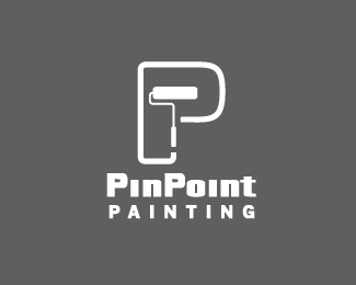
PinPoint Painting V2
by rudyhurtado • Uploaded: Jun. 30 '09
Description:
This is a painting company, they want a more corporate look to give them more credibility, no colours yet, I want to make sure the forms work first, I have to many options and I want to narrow it down to 3, I'm doing my survey but any suggestions will be welcomed, thanks.
Status:
Unused proposal
Viewed:
5526
Share:
Lets Discuss
i think this is my favorite, but I like the other concept with the smaller %22p%22 inside the larger %22p%22. not so fond of the %22pinpoint%22 type choice though.
ReplyI prefer this one as well.
ReplyNice
ReplyThis is my preference. Nice work.
ReplyThanks for your input guys, much appreciated.
ReplyI definitely like this one the best. Really represents the company well. Nice work!
ReplyThanks for you input Joe, it's helping alot.
ReplyYeahhhh this rocks!!
ReplyHey Rudy. I'm with the others that this is the best of the bunch.*We also had the challenge of branding a painter - check out http://logopond.com/gallery/detail/61583 for something along similar lines to yours.
ReplyCool Chris, very nice, and thank you for your comments, I guess I should start applying some colours, specially to this one. thank you Chris (rojo) as well.
ReplyThis is cool again.
ReplyI thank you for all your input Alex, Josh, Vikki, Jared, Bronte, Ed and John, it's becoming an easy decision.
ReplyRudy, just an idea - why not use only a paint brush roller and flip it horizontally - it looks like a P itself?
ReplyExcuse me, explanation - it is strange to see the line coming out of the handle and not being a trace of the roller... If you know what I mean...
ReplyHey Alen, I should try that for sure, thanks for the suggestion, no stone unturned in this case for me.
ReplyPlease login/signup to make a comment, registration is easy