La Bella
by StudioInk • Uploaded: Jun. 30 '09 - Gallerized: Jul. '09
Description:
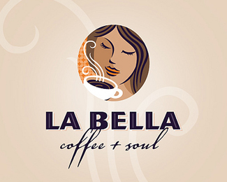
When a small coffee company came to us looking for assistance in making a name for themselves, we helped them become La Bella.
As seen on:
Studio Ink
Status:
Client work
Viewed:
11042
Share:
Lets Discuss
I've seen this logo around. Always thought it was nice.
ReplyI agree! Looks nice on your web as well!
Replycolors are great,,, feels like coffe is delicious in that place! what is the website i wanna see it!!!%0D*Congrats!
ReplyWoah Bella is Beautiful!! Great work guys!
ReplyBella logo.
Replycaptured the coffee and soul perfectly
ReplyBelisimo!
ReplyVSOP
ReplyAgreed, beautiful logo. I think the background is what makes it...gives it the essence we all like. I also really like the detail in the orange backdrop near the face. Keep em coming!
Replylooks real good
ReplyI like coffee! And i like this logo! Belisimo! %3B-)
ReplyThis one has me scratching my head. I know I made a comment on it in regards to the upper lip being too dark and looking a little masculine, if you will. I also don't recall the designer. I am very confused here because I could have sworn it was Dale Harris logo or some other designer here. My apologies if I have been mistaken.
ReplyI know someone else out there knows what I'm talking about. I saw this over a year ago?? hummm...
ReplyDale Harris is one of the partners comprising Studio Ink. %3B)
Replyaha, see I'm not losing my mind after all. %3B)
Replyi think ive seen this, its nice though
Replytotal RIPOFF, you should be ashamed**http://logopond.com/gallery/detail/36847
Reply@acusador Utter nonsense. Not remotely similar. I also recall you posting equally ridiculous accusations on my Lightbox logo.
ReplyI agree with firebrand. Not even close.
ReplyOh I see, if you rotate the logo and change the mouth and eyes and add some color to the hair is not a ripoff? I see, so the circle being the EXACT same size, and the nose and eyes being in the EXACT same position is just coincidence....right.**Check it yourself, you don't see it if you don't want to http://logopond.com/gallery/detail/84295
ReplyYou're wrong about the eye and nose being exact. They're similar but not the same. Compare your %22proof%22 logo and this side by side. I do enjoy the drama though. /popcorn
ReplyNot to mention, read my comment and believe Dales upload was posted prior to the other Aug 08.
ReplyThat's right Mike this was originally posted by the designer, Dale Harris, way before the Santa Isabel logo. Dale no longer participates on Logopond because of issues with Brandstack.
ReplyNow this just got very interesting as far as I am concerned (this is Dale btw %3B) ). I have just done a bit of research myself into our La Bella logo and what proof is out there on the web as to how long ago it was designed, and whilst I do not have any proof besides my own word that this was designed well before the August 10th 2008 date given on the other logo (the original concepts for this logo were presented to the client on the 15th of April 2008), I do however have proof that an early version of it was listed on a number of sites prior to August 10th 2008, including well known logo inspiration websites including Creattica.com (then faveup.com), Logosauce, Behance.net and of course Logopond on the 9th of August. (the ones I could find URLs for are listed below) **http://www.identityarchives.com/detail.php?id%3D1142*http://www.designerid.com/portfolio.php?id%3D11016*http://www.logosauce.com/logos/27761*http://creattica.com/logos/la-bella/5451*http://www.behance.net/Gallery/La-Bella/115458**I personally find the fact that our logo was listed on all these sites and then a day later a similar logo was uploaded to Logopond VERY interesting.
Reply!http://www.studioink.com.au/linked/labella-folio-lp.jpg!
Replyway to wake people up %3B)
ReplyWell, I was just thinking about things and really there is much more to a successful identity program than just a logo, and thought that maybe we might show some of our identity rollouts.**Plus I reckon that this is something that LP has over BS, designers with real clients who roll out complete identity programs. Not just a quick logo and a goodbye %3B)
ReplyHa, I just hope your not starting a Behance trend here :) Impressive Dale.
ReplyCheers, nah not looking to do anything other than defend my work with that url I promise.**Thanks for your kind words, though I should make sure that people know that Studio Ink %3D Dale Harris Leah Hartley, as the work is collaborative in almost all instances with either one or the other of us leading each project, I really can't take the credit for our work on my own :)
ReplyHmm, the comments thing removed the plus between Leah's name and my name.. very strange..
ReplyHey Dale, very nice champ. I so wish that the pond would head more in this direction.
ReplyNah, definitely not looking to do anything other than defend our work with that url I promise.**Thanks for your kind words though I should make sure that people know that Studio Ink %3D Dale Harris plus Leah Hartley, in almost all instances all of the work is collaborative with each project either lead by one of the other of us. I can't take credit for our work on my own. %3B)
ReplyHA, glitches are great! hey GRATS to both of you then and Leah is ringing a bell in my head?
ReplyThanks BrandSimplicity, I hope so to.
ReplyYeah she is a member here in her own right too. http://logopond.com/members/profile/13026
Replythe mark feels like one that has already stood the test of time, if you get what I mean
Replyhey! very nice logo.**what is the type used in it? i really like it, and it somehow looks familiar but i cant think of what it is.
ReplyI saw this logo so many times, love it!
ReplyThanks for your kind words everyone.
ReplyPlease login/signup to make a comment, registration is easy