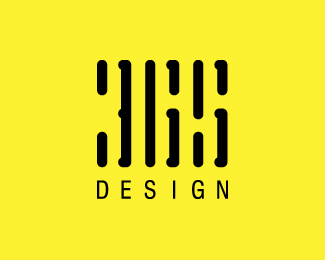
The lines above %22design%22 say %22365%22. The lettering is custom and stylized to appear similar to a bar code. The company is specialized in branding so I wanted that to stick with people when they remember the name.
I found it extraordinarily hard to get the numbers 365 out of that without reading the title. I think there are probably better type choices for %22DESIGN%22 too.
Yeah, it took me a long time to realize that it was %22365%22 (had to read comments, too).**My first thought was to look in the %22white%22 space (or in this case %22yellow%22 space), but the actual type is in the black lines. Not what you'd expect.**Looks cool, though :)
Yeah, I kinda like that you have to blur your eyes a bit to see the numbers but it may be too abstract for many people.**I'm gonna work on some variations soon.
Great mark, once I realized it was %22365.%22 However, I initially saw %22HGS.%22**Perhaps working with the thickness of the marks, you could better portray a %22365?%22
In response to macessences, I looked at that logo and there are similarities but still this is a different concept based on the style of a bar code. Since the lines aren't as thick and the spacing is different it gives a different presentation.
I have been getting a lot of mixed reviews on this logo. The target demographic is mid-level businesses, how do you think they will react to this logo?**I'm curious to know your thoughts.
I feel yellow and black are definitely not the colors if u r targeting Businesses. Maybe a grey instead of black would add some lux to it. **Straight edges instead of rounded edges and reducing the space between the lines might also solve the problem to an extent.
without any explanation I doubt any of us designers would know what it stands for...let's alone the casual reader. Visually it really looks great...but readability comes first.
IMO this design does not work. It seems your trying to hard for some cleverness rather than strong and memorable mark which makes a good logo. If you can capture both it's always great. I like logos that you have to take a second look at to figure it our but this does not make it it IMO.
I must agree with Mike. It took me about 30 seconds to figure it out and I showed it to a graphic design buddy of mine and it took him almost 5 minutes. Its a good feeling when you figure it out but I don't think its worth it. Just my two cents...
Not saying it's bad just questioning if it could be improved, simplified so the average viewer could relate? and if so that would make it more memorable and stronger. Think like a laymen when designing, I admit I've gotten sucked into cleverness myself but have to cater to everyone IMO.
Yeah, I think your right. Some horizontal lines could help distinguish the %22365%22. Once again I appreciate your input!**I admit I can get real caught up in the cleverness.
I liked Raja's version for the 365 mainly because the 'x' was a surprise:*http://logopond.com/gallery/detail/1337*I do agree with others though that '365 design' needs to be placed beneath the mark.
I know you're going for the bar code look but when i see bar codes, they are solid lines, not broken. I don't know if that look can be achieved here and making the numbers readable goes against the symetrical pattern that a bar code is. Maybe you could try adding sharp corners instead of round ones at important character strokes or put in some thin vertical lines as well to make it look more like a bar code and not be overly distracting. just food for thought.
Actually I think it's great, I don't have a problem with people needing time to find something. The arrow in Fedex goes unnoticed all the time. Anyway I believe the problem is not so much with clarity of the design but the fact it's on screen. Print this out, then show it to others and see if they can read 365. It should be easier visually since black is more prominent in print being pigment. Whereas here people see the neg space first because it's lighter and on-screen is light based. If this is exclusively for web, well... you may need to re-think the color scheme, or at least invert them.
Wow! I love this use of white space and gestalt! It also kind of plays tricks on your eyes and mind, sort of when you draw a cube and you see 2 different views. Great!
WOW all I can say is wow. Amazing creativity and thought went into this one along with extreme cleverness. Took me a while to see the 365 but when I did I was amazed!


Lets Discuss
But I love it! This is awesome!
ReplySorry, no but there. I love it! is what I meant. :)
ReplyForgive me, but could someone tell me what the lines above 'design' are supposed to say? It's a little unclear. Sorry if that offends...
ReplyThe lines above %22design%22 say %22365%22. The lettering is custom and stylized to appear similar to a bar code. The company is specialized in branding so I wanted that to stick with people when they remember the name.
ReplyWow this is way awesome! Nicely done man!
ReplyFascinating but I can't stop seeing an H rather than a 3.
ReplyReminds me of one of those magic eye pictures. You kinda need to diverge the eyes to see it. Contrasting and memorable.
ReplyI appreciate the comments!
Replyi think people need to read 365 but its not very clear and it seems to need a little help:)
ReplyI read Hli!i
Replyunfortunately i agree tokostyler, it looks good but i cannot read/imagine it without the additional info
ReplyIt took me a while but I got it, then I see it clearly.
Replynice, but I read BIAA at the first sight, the negative space
ReplyI found it extraordinarily hard to get the numbers 365 out of that without reading the title. I think there are probably better type choices for %22DESIGN%22 too.
Replyi dont see it
ReplyI might need to do some tweaking to get the 365 to stand out a little better.**The input is much appreciated!
ReplyYeah, it took me a long time to realize that it was %22365%22 (had to read comments, too).**My first thought was to look in the %22white%22 space (or in this case %22yellow%22 space), but the actual type is in the black lines. Not what you'd expect.**Looks cool, though :)
ReplyYeah, I kinda like that you have to blur your eyes a bit to see the numbers but it may be too abstract for many people.**I'm gonna work on some variations soon.
ReplyGreat mark, once I realized it was %22365.%22 However, I initially saw %22HGS.%22**Perhaps working with the thickness of the marks, you could better portray a %22365?%22
Replynice but I made some time ago on the basis of the logo 'beed' - http://www.behance.net/Gallery/Logopack-01/222038
Replyyeah.. I have to agree with some that this isn't readable.. not until the 365 was explained to me...
ReplyIn response to macessences, I looked at that logo and there are similarities but still this is a different concept based on the style of a bar code. Since the lines aren't as thick and the spacing is different it gives a different presentation.
ReplyI have been getting a lot of mixed reviews on this logo. The target demographic is mid-level businesses, how do you think they will react to this logo?**I'm curious to know your thoughts.
ReplyI feel yellow and black are definitely not the colors if u r targeting Businesses. Maybe a grey instead of black would add some lux to it. **Straight edges instead of rounded edges and reducing the space between the lines might also solve the problem to an extent.
ReplyI really take a long time seeing the logo, but just understand what the lines means cause you explain. Visually is nice but funcionally not.
Replywithout any explanation I doubt any of us designers would know what it stands for...let's alone the casual reader. Visually it really looks great...but readability comes first.
Replyjust curious, have you thought about putting %22365 Design%22 instead of just %22Design%22 on the bottom. That would help reinforce the mark imo.
ReplyI agree with jakes. It's cool, but with 365 design under would reinforce your mark.
ReplyYeah, I think that adding %22365 DESIGN%22 under the mark would solve readability and also reinforce the mark.**I will try that, thanks for the input!
ReplyIMO this design does not work. It seems your trying to hard for some cleverness rather than strong and memorable mark which makes a good logo. If you can capture both it's always great. I like logos that you have to take a second look at to figure it our but this does not make it it IMO.
ReplyI respect your opinion logomotive, but I also think cleverness plays a role in making a logo strong and memorable.
ReplyI must agree with Mike. It took me about 30 seconds to figure it out and I showed it to a graphic design buddy of mine and it took him almost 5 minutes. Its a good feeling when you figure it out but I don't think its worth it. Just my two cents...
ReplyNot saying it's bad just questioning if it could be improved, simplified so the average viewer could relate? and if so that would make it more memorable and stronger. Think like a laymen when designing, I admit I've gotten sucked into cleverness myself but have to cater to everyone IMO.
ReplyWhy not try 3 horizontal lines, don't know just offering my 2 cents also. Do your own thing though.
ReplyYeah, I think your right. Some horizontal lines could help distinguish the %22365%22. Once again I appreciate your input!**I admit I can get real caught up in the cleverness.
Replywow.. very hard to see it, but once you see it, very clever
ReplyHere is a revision to this concept. I'm curious to know your thoughts!**http://logopond.com/gallery/detail/69210**
ReplyI liked Raja's version for the 365 mainly because the 'x' was a surprise:*http://logopond.com/gallery/detail/1337*I do agree with others though that '365 design' needs to be placed beneath the mark.
Replyhard to understand, after complaining too. but good idea..
ReplyI know you're going for the bar code look but when i see bar codes, they are solid lines, not broken. I don't know if that look can be achieved here and making the numbers readable goes against the symetrical pattern that a bar code is. Maybe you could try adding sharp corners instead of round ones at important character strokes or put in some thin vertical lines as well to make it look more like a bar code and not be overly distracting. just food for thought.
ReplyThanks for the input!
ReplyThat's an excellent idea out here... awesome.
ReplyThanks smalireddy!
ReplyActually I think it's great, I don't have a problem with people needing time to find something. The arrow in Fedex goes unnoticed all the time. Anyway I believe the problem is not so much with clarity of the design but the fact it's on screen. Print this out, then show it to others and see if they can read 365. It should be easier visually since black is more prominent in print being pigment. Whereas here people see the neg space first because it's lighter and on-screen is light based. If this is exclusively for web, well... you may need to re-think the color scheme, or at least invert them.
ReplyThanks for the input! I will consider your suggestions. :)
ReplyI just finished another concept for this company and I think it works nice. I would love to hear your opinions!**http://logopond.com/gallery/detail/70182*
ReplyIt gives an interesting look, but personally I think if something is not legible or people have to ask what it is, it doesn't work
Replyit hurts my eyes to make out 365...but nonetheless very nice concept*
ReplyLol, don't hurt yourself bmyhousekey. Thanks for the comments!
ReplyWow! I love this use of white space and gestalt! It also kind of plays tricks on your eyes and mind, sort of when you draw a cube and you see 2 different views. Great!
ReplyThanks Bonnie!
Replyjust saw the 365. its creative. love hidden numbers in logos.
ReplyWOW all I can say is wow. Amazing creativity and thought went into this one along with extreme cleverness. Took me a while to see the 365 but when I did I was amazed!
ReplyPlease login/signup to make a comment, registration is easy