Tiny Fish Media
by novaolas • Uploaded: Jun. 26 '09 - Gallerized: Jun. '09

Float
(Floaters:
15 )
Description:
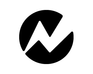
This is a logo for a company that has businesses in the printing and record label professions. Any feedback would be awesome, thank you.
Status:
Unused proposal
Viewed:
9871
Share:


Lets Discuss
It took me awhile to see the %22f%22 but the concept definitely has potential
ReplyWow. This is probably one of the coolest designs that I have seen on this website. You pay great attention to detail. You must have spent alot of time and hard work on this logo. The %22f%22 may be difficult to see but once you do, you can't not see it. I give it an A very creative, great idea. Keep up the sweet ass work.
ReplyGreat concept
ReplySiah-Design: I have been playing with the look of the %22f%22 to make it look more pronounced. You have any thoughts?
ReplyWow on the front page in two days how does that happen? Thank you nima.jezireh, siah-design, l-emental designs and mindasuern for you comments.
Replyfantastc mark!!
Replyhmmm...must just be me but that mark is a weird jumble
Replylogoboom: How do you mean a %22weird jumble?%22 Like the type doesn't work with the symbol? Do you have any suggestions?
ReplyI think the logo works really well. The mark is interesting and clever and the type works with it too. Nice job I reckon.
ReplyThank you cseven I appreciate it.
Replyconcept is good.
ReplyI can't find the %22f%22. Where is it?
ReplyI think its close, but needs a bit more attention in defining the %22t%22 and the %22f%22*Aside from that, I'm not feeling the %22TINY FISH%22 font so much. It seems a tad plain to me and the isometric angle on the letters doesn't seem to fit. The %22S%22 seems like a different font altogether. I think with a little work the logo could be excellent.
ReplyPlease login/signup to make a comment, registration is easy