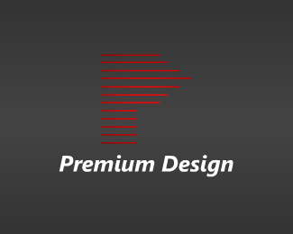
Thanks for commenting on my design. As for this one of yours, I'd be tempted to make the %22P%22 italicized. Also, I'm a fan of 'smooth versus pointy' -- I got that habit after learning that the animators in Disney films made the villains 'pointier' than the heroes/heroines to subconsciously project a feeling of 'ouch!' and 'knife-like' emotions. So, my first thought is...make it more graceful, more flow-y. Love the concept%3B I say keep the horizontal lines, but make the edges come to represent an angled %22P%22....let me know how it turns out. I'd love to see it! :)
Agree with Lefty and All Design. Though I think it is a very good idea if you find the right representation, too many thin and pointy lines with no apparent reason to where they are placed don't make it work. Draft a little more.

Lets Discuss
Thanks for commenting on my design. As for this one of yours, I'd be tempted to make the %22P%22 italicized. Also, I'm a fan of 'smooth versus pointy' -- I got that habit after learning that the animators in Disney films made the villains 'pointier' than the heroes/heroines to subconsciously project a feeling of 'ouch!' and 'knife-like' emotions. So, my first thought is...make it more graceful, more flow-y. Love the concept%3B I say keep the horizontal lines, but make the edges come to represent an angled %22P%22....let me know how it turns out. I'd love to see it! :)
Replythanks for your suggestion, I update this logo ,this border is bolder.
ReplyStop spamming comments in other logos.
ReplyAgree with Lefty and All Design. Though I think it is a very good idea if you find the right representation, too many thin and pointy lines with no apparent reason to where they are placed don't make it work. Draft a little more.
ReplyPlease login/signup to make a comment, registration is easy