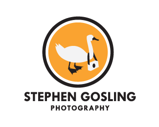
Stephen Gosling Photography
by Lock_Designs • Uploaded: Jun. 25 '09
Description:
This was the first idea I had when I got the job.
Status:
Client work
Viewed:
3881
Share:



Lets Discuss
awesome idea, but can you do something to make the goose look %22younger%22? looks like a normal adult goose.
ReplyI tried a very light feathering to the body to give it the soft almost hair-like light feather look, but all it did was make the goose look like it was glowing or shaking really fast. I also tried manually adding tufts to feathers but it just looked spiky. Maybe it is the proportion of the feet and bill to the size of the body that make it look like a full size adult rather than a true gosling. Any suggestions would be greatly appreciated? PS I'm using Illustrator
Replyi agree, you could play with proportions. maybe think of it in a cartoonish way, how do cartoons make adult characters look younger? maybe a larger head to the body and large feet? maybe it's the position, what if he was sitting with his legs in front and the camera is in front of him like it was playing blocks or something. hope you find a solution lock_Designs.
Replyyou know, a bunch of goslings, with only one having the camera....that might work. and the proportion is that of an adult, so i'm right there with you on that one. 'fluff' doesn't really need to be there. quality on your graphics is excellent, by the way. proportion of text to pic is great. will shrink well, if need be for biz cards or a website.
ReplyHeh, cool...
ReplyVery memorable :)
ReplyYeah Siah, like goose shot our photos! Very brandable stuff...
ReplyPlease login/signup to make a comment, registration is easy