fish
by vasvari • Uploaded: Jun. 25 '09 - Gallerized: Jun. '09
Description:
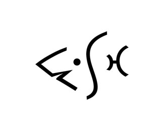
Personal logo design for fish. This is logo created for the fish. (A fish, a shark.) It is company name is Fish, it is in the retail industry and it is based in Australia.
As seen on:
http://petervasvari.com
Status:
Client work
Viewed:
25278
Share:


Lets Discuss
nice!!
Replycool!
Reply*
ReplyThank you very-very much!
ReplyThe idea is very very nice... but I have some difficulty to read the word %22FISH%22...
ReplySz%E9p munka! Gratul%E1lok!
ReplyIt was great fun!**K%F6sz%F6n%F6m Zerido a dics%E9r%F4 sz%E9p magyar szavakat! (Thank you Zerido hungarian fair speeches!)
ReplyNice idea, but the word fish is not readily noticeble.
ReplyThe recognition do one's heart good. It was the concept.
Replyit wasn't a fast read, but i was delighted when i noticed it!
ReplyGreat concept...but i do agree, the word is not readily noticeble.
ReplyI see! Thanks!
ReplyCLEVER! I think it's majorly cute too.
ReplyIt is very good of you!
Replyfunny!! i like it!!
ReplyThousands upon thousands thanks! I feel like working - away :)
Replycool :)
ReplyThanks mobiluri! I like it! The fish... :) to watch under the water.
ReplyI think this is great. With regard to some of the legibility comments, I saw the word %22fish%22 right away. It's a bit abstract, sure, but the fact that the image clearly depicts a fish ensures readability of the word. I like this one a lot.
ReplyThank you atomicvibe :)
ReplyYou bet. Keep up the good work!
ReplyOk, all right atomicvibe!
ReplyMaybe is difficult to read fish but is the only thing I can read%3B) AWESOME
ReplyThanks Mil %3B)
Replycool
ReplyThanks Lady!
ReplyI see the word %22FISH%22 clearly%3B it's all bones and no meat, that worry me!%0D*I think it's a great Logo!
ReplyThank you Alex!
ReplyPlease login/signup to make a comment, registration is easy