by almosh82 • Uploaded: Jun. 25 '09 - Gallerized: Jul. '09
Add to Pad (In 65 Pad s )
Description: .. Status: Unused proposal Viewed: 24253 Share:
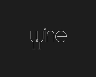
The concept is really nice but make the motto bigger, maybe on 2 lines? or simply remove it. oh and the type larger, much larger i guess.
Thanks..Updated.
Very nice - I like the font and the mark is clever. I agree that the tagline needs to be bigger though.
Hey, way much better now, congrats for entering the gallery!
The concept is nice..but probably it doesn't work in grayscale and that would be a limitation while using this in a print job!
Egree with KGRZ.
This would work fine converted to grayscale. Love it.
Beautiful execution. Yep, I would also like to see tagline bigger. Also....text seems far apart from logomark. Almost detached. Nice work, tho, overall.
Thanks a lot guys.
Why should he simplify the colors?
Nice logo :)
Very cute. I like it!
Excellent choice of font.*The logotype seems slightly disjointed from the mark.
I think its really cool
- Nice!
Thanks everyone.
Hi,*Please can you get in contact with me.*I have logo design work that you might be interested in.*bassey3%5Bat%5Dgmail.com*Thanks,
Absolutely love the colors!!
The use of color is just perfect...really beautiful !!
Great stuff! How do i get in touch with u?
Please login/signup to make a comment, registration is easy
Follow


Lets Discuss
The concept is really nice but make the motto bigger, maybe on 2 lines? or simply remove it. oh and the type larger, much larger i guess.
ReplyThanks..Updated.
ReplyVery nice - I like the font and the mark is clever. I agree that the tagline needs to be bigger though.
ReplyHey, way much better now, congrats for entering the gallery!
ReplyThe concept is nice..but probably it doesn't work in grayscale and that would be a limitation while using this in a print job!
ReplyEgree with KGRZ.
ReplyThis would work fine converted to grayscale. Love it.
ReplyBeautiful execution. Yep, I would also like to see tagline bigger. Also....text seems far apart from logomark. Almost detached. Nice work, tho, overall.
ReplyThanks a lot guys.
ReplyWhy should he simplify the colors?
ReplyNice logo :)
ReplyVery cute. I like it!
ReplyExcellent choice of font.*The logotype seems slightly disjointed from the mark.
ReplyI think its really cool
Reply- Nice!
ReplyThanks everyone.
ReplyHi,*Please can you get in contact with me.*I have logo design work that you might be interested in.*bassey3%5Bat%5Dgmail.com*Thanks,
ReplyAbsolutely love the colors!!
ReplyThe use of color is just perfect...really beautiful !!
ReplyGreat stuff! How do i get in touch with u?
ReplyPlease login/signup to make a comment, registration is easy