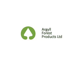
Argyll Forest Products
by eziemac • Uploaded: Jun. 18 '09 - Gallerized: Jun. '09

Float
(Floaters:
47 )
Description:
Some of you may have seen this on the forum ;)
As seen on:
euanmackenzie.com
Status:
Client work
Viewed:
7992
Share:


Lets Discuss
Looks awesome. You dont see many round logos these days.*Reminds me of a button on a pair of Levis.
ReplyHey Ez, I love the %22uniqueness%22 this has. It looks like a button :) Just be sure you don't lose the small lettering when you resize this to fit business cards and such
ReplyCheers Nathan and Jenny :)**yeah, the lettering was a concern and something i spoke to the client about. Its always going to be hard to put so many words on a circle path, especially words like 'Tighnabruaich'!!**It should be fine on print but i think small sizes on the web are the main concern.
Replynice, it looks very timeless.
ReplyYea Timeless...
ReplyWait, so you convinced them to use this one? Nice work.
Replyyep looks cool , reminds me of the spar logo, but it should be fine. *Link for ref http://www.spar.co.za/images/logoSpar.png
ReplyClassic and beautiful. I could see the stationery on a nice ivory paper stock.
ReplyThanks for the floats :)**@Jared: yep, i done what they wanted but put my fav logo right in there and they liked it. Stubborness prevailed, hoorah!**cheers Reghardt, i think i could get away with it. The spar logo never came into mind throughout this but it is quite similar.**cheers Kev :) I really appreciate the encouragement. really do :)
ReplyNice one Euan. This can work across such a wide spectrum of material - good job!*Why not simply drop the small text if you have to use it really small?
ReplyThanks Chris.**Client requests though, but i suppose i could drop it just for the sake of my website etc.
ReplyThanks Nima :)
ReplyI can't put a finger on it. Perfect Euan!
ReplyThanks Mabu, i appreciate it.
ReplyCheers Dalius, i think im pretty safe from the poker logo though :)
ReplyNo it doesen't look like the casino logo. But it looks like the Spar logo. A relativly succesful supermarket chain europe.*http://gartenfest.at/archiv/2008/sponsoren/spar.jpg
ReplyThat was actually mentioned in a comment previously.**Thanks for your interest though.
ReplyLooking forward to seeing this printed mate, hopefully some pics on your site soon. I hope they pick a good paper stock!
ReplyWow this is one seriously good looking logo. PERFECT. Sexy. love the colour. brilliant job!
ReplyAye, me too Neil. Reckon i should just print it here on some nice thick paper?**Hey, thanks Jess! Really glad you and others like it, was difficult to pursuade the client to budge from thier own idea so im really happy the way things turned out. Win-Win for both of us. %3B)
ReplyReally love this. It is an instant classic logo
Replythanks man, really appreciate it :)
Replybeautiful logo, classic
ReplyPlease login/signup to make a comment, registration is easy