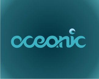
oceanic
by tasbo • Uploaded: Jun. 17 '09 - Gallerized: Jun. '09
Description:
alternative energy by the ocean waves
Status:
Student work
Viewed:
16220
Share:




Lets Discuss
i like the light blue color you have in the dot of the %22i%22, would be nice to see it used to bring depth to your type.
Replyso elegant and well done
Replyvery nice!!
Replylooks good mate:-)
Replythanks everyone
ReplyJust so beautiful, specially the 'i'
Replyvery nice
ReplyQuite an aquatic mark :)
ReplyYou have obviously spent time on this. It is an excellent idea but could be worked a little harder to be perfect. For example the thicknesses vary between the curls in places. I really believe improving the symmetry would add 50%25 more wow factor to this logo and polish it up. It's worth it because the idea is so good.
ReplyPerfect union of typograhpy and shape!
ReplyJUST AWESOME!!!!!!!!!!!!!!!!!!!!!!%0D*if you convert it into a font, I'm surely goin' to buy it!!%0D*GREAT JOB!!
ReplyPlease login/signup to make a comment, registration is easy