TravelWorld
by brandberry • Uploaded: Jun. 16 '09 - Gallerized: Jun. '09

Float
(Floaters:
85 )
Description:
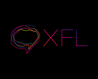
Logo for TravelWorld.su
http://TravelWorld.su/
As seen on:
http://brand-berry.ru/
Status:
Client work
Viewed:
32340
Share:


Lets Discuss
looks very nice!
ReplyI like it a lot very nice!
Replylooks really well, gj!
ReplyI like the motion in the mark.
ReplyGreat colors. Reminds me a bit of hh's Hollow Men logo (http://logopond.com/gallery/detail/43127), but I think it's sufficiently different. Nice work!
ReplyThe mark is absolutely gorgeous!
Replygorgeous!
Replythe artwork is great!
Replygreat colors
Replywinds-movement-travel, ingenious, really great mark!
ReplyIt looks great. I love the colors too.
Replyniceee.. *
Replysimply beautiful!
Reply%09*is a face of a woman?*I like
Replyvery purdy
Replyawesome colors! and the swooshes look great!
ReplyGreat colours.*I can almost feel the wind blowing those streamers/hair.*It did however take me a while to realise it was the face of a woman.
ReplyThank you all, i am happy that you (like me) feel this wind
Replyit's so good! brilliant face!!
ReplyVery powerful! Beautiful.
ReplyThe typeface is clean and gorgeous...it's not clear what this is for.
Reply%5E Uuuhh.... Travel perhaps %3B )
ReplyHi brandberry *The form and colors look great. It definitely looks catchy.*
Replyawesome :)
Replykewl,,,awsom colours..weldone
ReplyI think I will be the honest one here... %22myco%22 started to say it, %22...Reminds me a bit of hh's Hollow Men logo (http://logopond.com/gallery/detail/43127),...%22 In my opinion, it looks TOO MUCH like the Hollow Men logo. The logo has a cool effect, but it is pretty much a copy of the Hollow Men logo.
ReplyЗдCEрCEвCE)
Replyawesome :)%0D*
Replyphenomenal mark! love that face.
Replyawesome mark !! respect
ReplyA very beautiful logo! Incredibly eyecatching. I love the colors. The head itself is very iconic and unmistakable.
ReplyI do not think this is derivative of the Hollow Man logo. But even if it were inspired by it, this is just so much better executed. Sorry. This is just really beautiful. Does that excuse the design if it is found to be derivative, no, but I would hate to see this go.
Replygreat %26 colorful mark, maybe improve the type a little bit, well done!
ReplyIn 2010 trends to! Gratz!
Replylove the typography... what is this? great work!
Replygreat colors & face
ReplyPlease login/signup to make a comment, registration is easy