drunk-people.com
by tass • Uploaded: Jun. 15 '09

Float
(Floaters:
3 )
Description:
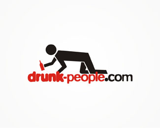
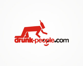
logo for a blog, i guess there's no need to say more about the blogs subject :D
As seen on:
www.alextass.com
Status:
Unused proposal
Viewed:
2762
Share:


Lets Discuss
I like this version best :)
ReplySooooo....why is there a bottle balancing on the figure's back? Also, what should probably be another arm in perspective is used as the figure's neck... The blurriness of type is good for this -- because it's about being drunk %5Bthings get out of focus%5D. But when paired with a logomark such as this, that cool effect is overlooked. Suggestion: eliminate the figure. Make the type bigger and blurrier. Forego the figure altogether. %0D*%0D*BUT if you must have a figure there....space it above the type so there is some breathing room between type and figure. Also, draw the figure accurately %5Bin perspective%5D, sans bottle on the back, and with a neck that doesn't make it look like an ostrich. Nice concept%3B keep working on it.
ReplyJF, I think the bottle is actually replacing the figures head and he's grabbing for his head on the floor. lol
ReplyWow....well, um, still recommend the changes above. Perhaps even more now.
ReplyHey, thanks for the comments. Actually is a 'metaphor' of having booze instead of head which is lost... somewhere... **Interesting answers thou, thank you!
ReplyPlease login/signup to make a comment, registration is easy