EMEU
by forfun • Uploaded: Jun. 13 '09 - Gallerized: Jun. '09

Float
(Floaters:
38 )
Description:
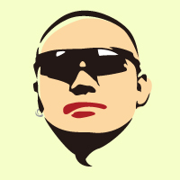
EMEU Outdoor Equipment,Idea Come From indigenous arts of Australian
Status:
Client work
Viewed:
11387
Share:


Lets Discuss
Nice aboriginal style but the type doesn't seem to fit.
Reply%5Eagree with firebrand, also in the neck area i would add a dot or two to help eliminate or reduce the white space.
ReplyCompletely agree with both Roy and George.
ReplyHAVE SOME CHANGES.THANK YOU GUYS%5E_%5E
Replyyep...great mark...bad typo
ReplyThank you,chez-boo.%0D*logoboom ,can you give me a good typo? Feel grateful...
ReplyGreat mark indeed. The type is off though as the others have mentioned. Perhaps something more hand rendered? Pay close attention to the curves and weight of the mark and create a type solution that matches. Good luck! :-)
ReplyThanks for your advice! %0D*Some new changes on the type.
ReplyYou're on the right track now. :-)
ReplyI read it now as CMCU, but yo uare on the right path. I'm still wondering about the white space between his neck and body, 2 dots will help eliminate that.
ReplyChange again.Read it now? %0D*GYUI,you are right!It's need a dot .I can't understand your idea at first,because I'm a bad boy when I study English:-)%0D*Thank you!
ReplyIs there any reason you have added the additional 'e' in Emeu? It works phonetically, but looks weird when written.**Nice logo though :)
ReplyWay cool! Nice job.
Replylove this style mate!
Replylove the mark!
Replyvery nice! good work mate!
ReplyWow! It's so aboriginal! Great style :)
ReplyThis is very nice!
ReplyNice emu. I'm liking this.
ReplyEmeu looks great! Сongratulation! :-)
ReplyI like it, i think the type is ok
ReplyPlease login/signup to make a comment, registration is easy