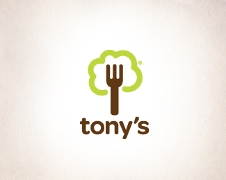
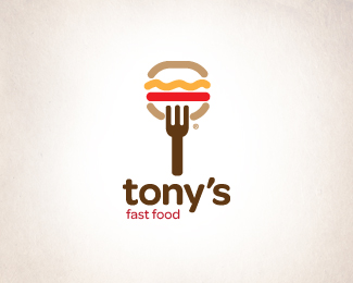
Tonys/SeaFood
by dado • Uploaded: Jun. 12 '09 - Gallerized: Jun. '09

Float
(Floaters:
38 )
Description:
The client asked me to develop sub-brands from the original logo.
can see the original at this link:http://logopond.com/gallery/detail/65881
Status:
Unused proposal
Viewed:
24268
Share:


Lets Discuss
Again very nice!*Just something with fish fin maybe shape, maybe just look bolder then rest maybe just my perfectionism.
ReplyOk, thanks!
ReplyGOOOOD MARK! I really, really like it!!!
Replyjejeje! thank you Peter!
ReplyI like the serie and color for each one! cool!
ReplyReally nice! Just wondering... what's that little greyish drop doing on top of that left tooth of the fork? Especially love how you kept the recognizable things of the old logo and integrated them into a far more better and cleaner looking brand. Chapeau :)
ReplyBien hecho amigo, como siempre. Adri%E1n. M%E9xico.
Replygreat!
Replyvery great!
ReplyThank you guys!!! :D*Gracias a ti tambi%E9n Adrian! %3B)
Replynice logo
ReplyLike this one too!
ReplyYour colours are great !!
Replyvery nice. clean simple and very effective!!
Replyvery nice work. i would agree with tomme about the little gray dot near the end of the fish—i don't think it's necessary. great colors. have you considered using a different font for seafood? maybe something in a readable script (nothing fancy, more fun) and centering it under tony's and on top of the y? Just a thought...
Replyvery nice work. i would agree with tomme about the little gray dot near the end of the fish. i don't think it's necessary. great colors. have you considered using a different font for seafood? maybe something in a readable script (nothing fancy, more fun) and centering it under tony's and on top of the y? Just a thought...
Replyque onda dado, very good job, keep going, you are doing ok. hug
ReplyWell done. My suggestion is to try making the fork's handle the same uniform weight as the fish outline.
Replylovely, great job
ReplyI really like your design. Add to favorite!
ReplyPlease login/signup to make a comment, registration is easy