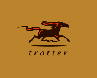
Pacer
by LaPalida • Uploaded: Jun. 03 '09 - Gallerized: Jun. '09

Float
(Floaters:
71 )
Description:
I think this was a logo proposal for something else at the time. I just reworked and renamed it. Could work for a printing press.
Status:
Unused proposal
Viewed:
14944
Share:


Lets Discuss
This is awesome!
Replythe mark is just amazing. love it!
Replylovely stuff
ReplyGreat!
ReplyThis one just gallops off the page! Great mark.
ReplyReally strong mark. Great job!
ReplyLove the style on the illustration.
ReplyOh my! Went to bed, woke up, and it's in the gallery!!! Woohoo! :) Thanks guys. I am actually reworking a few of my logos still. I think I will put up another version of this.
ReplyVery nice, but is it a trotter or a pacer?
Reply%3E_%3E oh yeah... I gotta fix that now.
Replyinteresting feeling
Replyhorse doesn't run that way:) good job though.
ReplyHi,%0D*%0D*Please put a way to contact you. Buyers will see your work and now they have no way to reach you. Please contact me at adadslife@gmail.com.%0D*%0D*Thanks. Nice work!
Replynice mark!!!
ReplyI don't think you could have picked a more appropriate type, I just think it needs to be bumped up a little or mark reduced? Nice style and type choice.
ReplyThis exuberates %22Sleek%22 perfectly executed, a floater for sure :)
Reply@ tokostyler%3B pacing horses do run like that actually - it's an extra gait so spot on%3B feels weird to ride one! Great mark%3B very elegant but funky
ReplyLove it.
Reply@logomotive - I tried that and I think you're right. Unfortunately I also changed the name which turned out to be less popular...**@BexH - actually he's kind of right and so are you. It is a different gait but they don't quite run like I depicted it... mine is almost flying! I really don't mind deviating... horses also don't have wings :P or horns etc. Also cerise was right it's not a pacer I got it confused. It's a trotter. However the name %22pacer%22 looks nicer... but when I change the horse to the appropriate gait it doesn't look as nice :P Oh well.
Reply@fourteez - sorry for the late reply! I didn't see it. I edited my profile so now my email is in there for anybody that wants to contact me.
ReplyThey actually do fly when they are at the stage you depicted, so no worries there. Pacer looks better IMO. Don't think many people would tell the difference unless it was for a Harness racing event or something anyway. Great job
ReplyAmazing !!
Replythe horse is so well rendered... it's just jawdropping.
ReplyThe horse is amazing.
ReplyPlease login/signup to make a comment, registration is easy