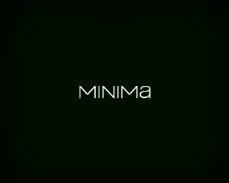
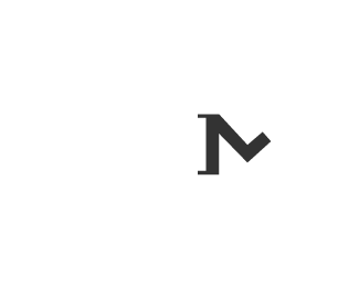
The Official Jared Lunde Logo
by lundeja • Uploaded: May. 31 '09

Float
(Floaters:
56 )
Description:
Barring unforeseen similar logos, and I mean exactly the same, this is the permanent Jared Lunde personal logo. I'm still working on a custom type, but I am incredibly satisfied with the mark.
My initials are JAL and it was really important for me to include the A because my middle name has a very personal and deep meaning to me, as I share it with my deceased grandfather (too personal?). Beyond that though, the pointing upwards is really all about my philosophy on life. Overall I love the branding potential it has and I can't wait to use it.
As seen on:
Logo Design Wisconsin
Status:
Client work
Viewed:
6366
Share:


Lets Discuss
This is very cool. Simple is the best.
ReplyHappy for you dude! good luck with the type :)
ReplyLiking bud. personal logos are so emotional.
ReplyThanks everyone :D **@Mike - I know right? I'm balling my eyes out over here. A woman couldn't satisfy me this much.
ReplyTrust me I know the feeling. Kudos.
ReplyIts fantastic! I love it :-)
ReplySweet, mate, well done :)
ReplyNice bro!
ReplyIm diggin' it mate! Very peaceful. Well done ya bam %3B )
ReplyWell done Jared, memorable and versatile, love it.
ReplySneh, Euan, Fabian, Neil, Rudy -- thanks so much. I'm really excited to get cooking with the rest of the identity.
ReplyMakes a statement :)
ReplyThanks Josh, I'm glad that it got across.
ReplyHaving stared at it for a bit, it does appear to have slight %22mustache%22:http://mooregroup.files.wordpress.com/2008/02/new_mustache020.jpg feel to it.
ReplyHahaha I might have to grow some handlebars. This would no doubt give me more reason to smoke my pipe and mutter %22Mmmyes%22
ReplyJared is growing a stache ya know, he planned this one. Just add a subtle smile (for A) and 2 dots for eyes now.
ReplyHehehe
ReplyI'm also looking for some constructive thoughts on the website design %22here%22:http://logopond.com/forum/viewtopic.php?id%3D3218
ReplyIt's also looks great on the website well done.
ReplyCerise, thanks! I think it's going to be a long and beautiful marriage.
Replyvery nice lundeja, i kind of also saw a road disappearing into the horizon, like it's the road ahead, an unknown road. and the stache too :)
ReplyI am still on the fence here, because i thought it has something to do with ice hockey? Maybe reflection is to blame :)
ReplyThanks George.**Bojan - My backup plan with it was to put a bit of a mountain in it and give it to the Colorado Avalanche
ReplyThanks Houston, nima :D
Replylike your personal logo :)
ReplyGrats on the feature, Jared.
Reply%5E Yep!
Reply%5EYep! Yep!
ReplyIndeed...congrats Jared.
Replycompliments on the featured! you have a nice portfolio
ReplyThanks all :D Means a lot coming from great designers like yourselves. Wow.
ReplyArrow Upward!
ReplyCongrats Jared :)
Replycongrats for getting in the featured gallery! :)
ReplyCongrats Jared! this is awesome! hope i get there too someday %3B-)
ReplySindur, Mike, Andrei, John. Thank you very much.
ReplyWell deserved Jared!
ReplyCongrats Big Yin!
ReplyThanks Rudy, Neil. Means a lot :)**Neil, my Scottish slang translator is giving my mixed results on that one so I'll go with %22Big Yin%22 being equivalent to %22Big Shot%22. I need more lessons.
Replycongrats with the feature, dude :)
ReplyBout' time. Congrats, Jared. Oh, and I dig your personal mark. It's very memorable.
ReplySorry, but I see real nothing that comes close to the description. It looks very corporate, slick and somewhat nondescript. I definitely prefer http://logopond.com/gallery/detail/50749
ReplyThanks Kevin, mister jones.**Barry %3D%3E Not supposed to jump out at you I guess. If I were to use a blatant JAL I think it would lose a lot of its memorability, originality, powerfulness, etc. The one you mentioned didn't really feel like me and I had been pointed in the direction of a few similar logos.
ReplyCertainly there%B4s nothing wrong with a more subtle approach, my first impression was: inactive volcano, literally and not so literally. Plus another detail, I%B4m not sure if it%B4s intentional or not: The name seems a little off-center.
ReplyLove this work :)
ReplyNot bad but it's reminiscent of the J. Lindeberg logo.
ReplyUnfamiliar with said logo and thank you for the link.
Reply!http://www.edopter.com/images_user/ideas/200805/bdPFzS! Found it and I'd say they are well different.
Replyagreed :)
ReplyThey _are_ different. They are in a completely different domain too.
ReplyI have to agree with RBeezy on this coz they are the same colour %3B)
Replyha ha Sean.
ReplyOh my goodness...Jared...how could you..lol
ReplyI see I let a lot of people down today. My days of deceit are over. Imma make you proud, paw.
ReplyHey Jared, I just realised that despite admiring your mark I've been remiss in floating it. Done.*%5E Love the Irish sense of humour Sean.
Replyyou are sharp as razor today Jared
ReplyThanks Jared. the Pot calling the Kettle Black.
ReplyDelete time!
ReplyI still like it very much Jared.
ReplyThanks again Rudy. I've only recently found the required time to start to really build a brand around it (sort of a good thing, I guess - busy busy). Trying to get my website done by Monday so I'm in for a long weekend.
Reply!http://www.jaredlunde.com/blog/wp-content/uploads/Picture-42.png! *I've been gradually tweaking the mark and type weight on this since June... If you feel like reading a short bit about it here's my blog spam lol %22Logo Evolution%22:http://www.jaredlunde.com/blog/logo-evolution/
ReplyI think you need more color blends. :)
ReplyI was thinking pink
Reply%5ERainbow
ReplyMay I suggest light gray
ReplyLight gray is wayyyy too flashy. I might go total simplicity, you know, white on white or something.
ReplyCan't wait to see it :)
Reply%22I might go total simplicity, you know, white on white or something.%22 Hahahahaha!!!**You know, I wasn't quite sure about this one in the beginning, but I've really grown to like it. All the subtle and minor tweaks to the mark are well worth it. The type compliments the mark well too. Good job, bud.
ReplyYea, I really like the type.
ReplySeriously, it%B4s a relief to see you%B4ve dropped the depressing light grey.
ReplyHey Jared - surprised to see I've never commented on this. Really like the type and the mark is cool, too.**One MINOR thing that is bugging me right now is the gray for the mark is just a tad darker than the gray for the type. Is this a conscious decision?**Grats!
ReplyThanks Kevin, Barry, Siah.**@Siah - You're right, it is. I forgot to switch out the color of the type when I updated the mark on it. At least it still matches, lol.
ReplyWhoops, thanks to Roy, too :D
ReplyCan't believe I haven't commented on this yet. Really classic logo Jared. Probably one of the ones that'll stick with me for a right long time. Cheers!*
ReplyI never say 'Cheers' in real life. Logopond is messing with my mind.
ReplySolid solid solid! :)
ReplyWhere have you been Mr. Lunde?
ReplyPlease login/signup to make a comment, registration is easy