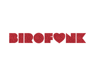
Bloom
by birofunk • Uploaded: May. 28 '09 - Gallerized: May. '09

Float
(Floaters:
40 )
Description:
Logo for gardening showcase
Status:
Unused proposal
Viewed:
18496
Share:


Lets Discuss
nice treatment
Replythanks tass, i appreciate the comment
Replysmooth! :D
Replyno problem, i really like it.**just an idea, for an option to see how it looks like you can try the leaf on b?*i think it might go a little into a cliche, but if you haven't try it i suggest you maybe you'll like it.
Replythanks andreiu! Tass i remember doing that when I designed the logo and the leaf on the b made it look slightly unbalanced. But I'll revisit it and see how it looks. Thanks for the suggestion!
Replyvery nice, though I have seen the leaves treatment on so many 'O' character logos. Still I like this logo and choice of typeface, Cocon? Well done.
ReplySo clean :-)
ReplyIs this 'bloom' in Ireland? If so, this was just mentioned on the longest running chat show in the world on Irish national television about an hour ago.**Ed.
ReplyNice logo! remember summer)
Replyyeah thats the one, buts its rampant here at the moment every health shop or juice bar having been treating one of the characters with a leaf or so... heres the bloom logo you mentioned. http://bloominthepark.com/**Still I like birofunks execution, I theres enough room in the world for different executions...
Replythanks for all the comments guys i really appreciate it! **mcdseven: yup, the font is cocoon..well spotted. **Vivara: Yes its Bloom In The Park. I pitched for the logo and site but unfortunately didn't win it.
Reply@birofunk... hard luck on not getting the pitch, for what its worth, I think yours is a better execution.
Replyit hardly popped out on the frontpage, but it was certainly worthy clicking it :)
Replythanks guys! so chuffed to have gotten on the frontpage
Replyvery nice, simple but the leaves make a strong statement :)
Replysimple and amazing.%3Ca href%3D%22http://wholebodyvibrationtherapy.net/%22 style%3D%22overflow: hidden%3B text-decoration: none%3B width: 50px%3B background-color: %23FFFFFF%3B display: block%3B float: left%3B text-indent: 1000px%3B white-space: nowrap%3B%22%3EVibration Traning, Vibration Platform, Vibration Therapy, Power Plate%3C/a%3E
Replynice logo birofunk, when did you pitch for the job?
ReplyNice logo birofunk. Did the designers who got the job (who shall remain nameless) steal the concept that you pitched? I'm sure you know too well that the final logo used for bloom is a poor, close relation of your design...
Replyno, the designers (who shall remain nameless) did not 'steal' the concept that birofunk pitched... the original brand was designed in 2007 was based on no other logo or close relation to birofunks design...**Birofunks design is very clean and sharp, I like it!
ReplyHey guys. Just to clear this up the logo that exists now, as Clare says, was the original logo for Bloom. The webiste was up for tender last year and i included this logo with our pitch.**Thanks for the floats and comments!
Reply%3Ca href %3D %22http://logooftheday.com/%22%3ELogo of the day%3C/a%3E
ReplyThis is a real beauty. The leaves add just the right amount of complexity. And nice colors too, the gradient is perfect.
Replythanks chad, I appreciate the comment
ReplyThis is really awesome, nice work!
ReplyThanks Joe, you've got an awesome gallery going on
Reply%3Ca href%3D%22http://www.logonest.com/2010/01/bloom/%22%3ESelected by Logonest%3C/a%3E
Replyi like it , nice
Replycheers, glad you do!
ReplySo good!
ReplyPlease login/signup to make a comment, registration is easy