Boltorials
by Type08 • Uploaded: May. 27 '09 - Gallerized: May. '09
Description:
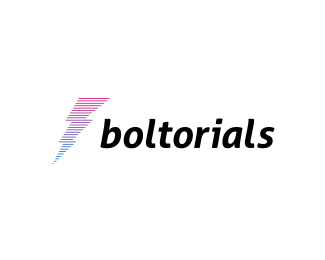
Naming and logo design proposal for a client from UK. It's for a fresh tutorial online service. Mark presents tutorial (text) lines forming a lightning bolt (proposed tag line was "lightning speed tutorials").
Status:
Unused proposal
Viewed:
10215
Share:

Lets Discuss
Awesome, I had a feeling it would look good on white.
ReplyHaha, thanks for looking in mate! I agree! :)
ReplyVery nice, love the mark and the concept mate! Also digging the type, the only thing bothering me is that space between 'L' and 'S'. It's kerned correctly, but you might think about moving the 'S' to the left a tad so optically it look better. Great work, nonetheless, Alen!
ReplyThanks Dalius! I kind of don't see it as a problem now, but it can be fixed, of course! :)
Replygreat job Type08, love the mark, look fab on plain white tee....
ReplyThanks Paul! It would, I agree! :)
Replyyoyo Alening ...welldone dude i like the concept aswell as your type selection ...hey dude which font is that ?
ReplyNot sure the bolt works on a small scale...
ReplyAlter Ego and GCWD thanks for looking in... Downsizing the logo makes the bolt look like a filled area, which is a cool effect since it has gradient effect...
ReplyAwesome as usual Alen! :)
ReplyThank you Mads! :)
ReplyPlease login/signup to make a comment, registration is easy