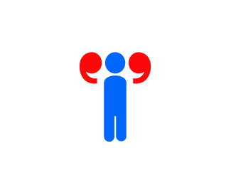
Optical Strength
by felro • Uploaded: May. 26 '09

Float
(Floaters:
52 )
Description:
Optical Strength. one of my favorite logos I have made up to date. Intentionally used as a logo for a company dealing with eyeglasses.
Status:
Unused proposal
Viewed:
16225
Share:


Lets Discuss
Very nice - it tells the story straight away.
Replyvery nice felro :D
ReplyThanks cseven and tabs, I greatly appreciate the comments.
Replyvery clever, I'm not sure about the sides of his legs (there seems to be a bump on either side) nice job nonetheless felro!
Replyvery good idea mate... the bumps do need sorting... are they shorts?
Replyfun icon, but would like to see how the type works with it
ReplyI like the mark. Very clever, and I was able to tell before clicking on it that it was related to glasses/eyes.
ReplyThanks guys, I appreciate the love! I'm still experimenting with type, thanks.
ReplyGreat concept!
Replythanks dude
Replygreat one! but i would try a sans-serif. :)
ReplyThat's cool! Id place the type beneath the mark though.
ReplyThanks for your insight guys. :)
ReplyClever, nicely...
ReplythanksPierro
Replyneed floats lol
ReplyPlease login/signup to make a comment, registration is easy