Niven Landscaping
by HayesImage • Uploaded: May. 21 '09 - Gallerized: Jun. '10
Description:
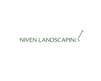
Wordmark for Niven Landscaping, something simple & neat was requested.
Status:
Client work
Viewed:
10847
Share:

Lets Discuss
Very subtle, Mr Hayes.
Replyclever :-)
ReplyAll part of my plan Mr. Smith %3B)%0D*%0D*Vikki%3B Thanks :)
ReplyHow did I miss this..awesomenes
ReplyThis is really good. Apart from the choice of colors :-)
ReplyThanks guys!!%0D*%0D*What flavor would you give it Alex? :)
ReplyThey are just too close and make the type virtually impossible to read when the logo is scaled down. Anything with a bit more contrast would work better. Black on white, perhaps ? :)
ReplyUpdated :)
ReplyTo be featured in Logolounge Book 6 :)
Replythis is really neat! I like this one.
Replythis is awesome
ReplyThanks Guys!! I'm actually suprised that this one made the logolounge cut...Glad you dig it :)
ReplyYeah dude, this is great
ReplyThis has always been one of my favorite wordmarks Josh, sweeeeet!
Replydiggin' this. very clever.
ReplyThanks Gareth, Joe %26 AGM (anonymous gallery moderator). :)**I don't get the chance to do a lot of wordmarks or custom type in general, so I always enjoy being shoved off my comfort plateau...we never stop learning. :)
ReplyThanks Mike :)**If anyone is wondering, the typeface used was Legacy Sans.
ReplySuper
Replynice n clever..
ReplyThanks!! Was a nice way to start the morning :D
ReplyThis is great.
Replygreat work Hayes!
ReplyJeez took me a long time to figure out what the sinking G and the nail mean. I just got it while typing this. Very nice, Hayes!
ReplyGreat one, Josh.
ReplyGreat stuff buddy!
ReplyVery cool. I %22dig%22 it! :-)
ReplyFantastico!!
ReplyThanks everybody :D**@ Julian: That's the effect I wanted :) wait for it, wait for it, ka-bow.**@ Radhacelis: An extra crossbar you mean? Like the crease you get in a typical shovel? If so, interesting thought :)**@ levelb%3B Funny stuff :) Glad people like what I'm shoveling :P
ReplyI meant to comment on this earlier, great solution (clever) *
ReplyYep, I remember this, quite clever!
ReplyThank you Craig %26 Sean, I'm still spun out about this being in logolounge 6, it still (to me) seems to be the opposite to what they go for...
ReplyGreat! Did you try an option where the %22G%22 is connected rather than broken up? I think that would help its readability.
ReplyThanks guys! I did try both options, but they just seemed a bit 'off'...having the complete G letterform made it look a little tacked on.**Having the shovel 'dug into the ground' made it seem (for lack of a better word) more purposeful, like work in the garden has just begun. Thanks again :)
ReplyWhat a concept.
ReplyThanks Mads :)
ReplyAmazing!
ReplyThanks Ibrahim! Glad you dig it. %3B)
Replyman this is brilliant. still love this one.
ReplyThanks Colin. It's to be able to use just type in some occaisions, typefacee characteristics can tell such a story in themselves.
ReplyPlease login/signup to make a comment, registration is easy