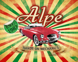
Alpe logo
by BrandonBarnard • Uploaded: May. 20 '09

Description:
this logo / business card was created for an old school italian mechanic, he still writes his invoices by hand and has a passion for MGA's. Now i know i am going to get feed back saying this is not a logo, it is too busy too many colours with the italian flag... but still i really like it, is it my best? NO.... if i had more time i would have vectored it up back time was an issue here... anyway your thoughts
As seen on:
www.agentorange.co.za
Status:
Nothing set
Viewed:
3736
Share:


Lets Discuss
like the idea of having the real car there. remove the background and the %22est. 1987%22 thing and it doesn't look too busy at all! You could also turn the car into a vector and just color it w some simple gradients to reduce the %22busy look%22.
ReplyOH, and I think it's awesome btw
ReplyPlease login/signup to make a comment, registration is easy