KKI
by hotsauze • Uploaded: May. 20 '09

Description:
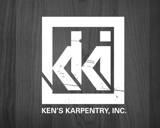
ken's karpentry, inc. wanted to rebrand themselves as KKI. i used a square with hard corners to keep it solid and then the letters seem to be cut out of the block. i have some trouble with the relationship between the words and the logo...
As seen on:
Status:
Nothing set
Viewed:
2513
Share:


Lets Discuss
I saw KiKi at first....The second %22k%22 seems to have a split in it causing this....In fixing that, super bold mark :)
ReplyI saw 'kiki' as well. Maybe angle or place that stress mark a little differently.**As an aside%3B of course I realize it's out of your control when it comes to a client's desire, but it evokes Klan-like symbolism to me... which is never a good thing. Perhaps you already had that discussion with them, but it's what they wanted anyway.
Replycut the top off. lower the dot on the i to be level with the top of the diagonal ascender of the k and bring your bounding box down. you'll end up with two capital Ks and a lower case i, but at least it will read correctly and you'll lose nothing from the concept or design.
ReplyPlease login/signup to make a comment, registration is easy