Turtle Island
by lundeja • Uploaded: May. 18 '09 - Gallerized: May. '09
Description:
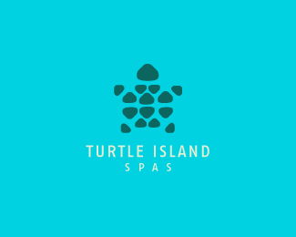
Not gonna pretend that I'm inventing the wheel by doing a turtle mosaic. I think I put a unique spin on it, though. I found a shape that I wanted to work with, sort of an imperfect triangular stone and I worked it into the shape of a turtle which ended up looking like a star as well.... so bonus I guess.
As seen on:
Website Design Wisconsin
Status:
Client work
Viewed:
29816
Share:




Lets Discuss
Great mark you've got here, i like it.%0D*I think you need to take all the center triangulars (i mean everything except the legs and head) and just move them down just i tiny bit, that way it would be centered to all the legs and won't be so close to the head.%0D*%0D*Thats it :) oh and i like the colors as well!
ReplyThanks Dima! Fixed as per your suggestion.
ReplyGreat mark/brand, colours work well together, nice job.
ReplyThanks Rudy, Toni.
Replymy husband is writing a trilogy called %22Turtle Island%22 (copyright 2008) and I'm totally pissed at you... I'll get over it eventually... (grumbles) good mark...
ReplyJared, I think there is so much more potential here? I like it but think I see more opportunities geometrically. Even with the current triangular shapes.
ReplyLOL, Trish. Sorry :)**Mike, thanks for your input. I'll have to explore it a bit more and hopefully see what you see.
ReplySeems like the typography needs some attention. The icon is a mosaic of rounded stones, which people would relate to objects found in nature, but then you have a very corporate typeface. They don't seem to mesh well together. Something a little more hand written? It is a spa after all. Maybe just write out the name and scan it in? Perhaps take a typeface and grunge it up slightly. Try different things, but this current typeface doesn't seem appropriate.
ReplyAnyone else see an %22I%22 down the center of the turtle's back? The arms could make a %22T%22 as well, but the spacing is needed. My eye is drawn there for some reason. I would try matching that with a serif font...just a suggestion. Nice work though!
ReplyElegant, yet cute, all at once. Very nice!
Replysimple, fresh, cute and sleek. Wonderful execution :)
Replyi think its pretty much perfect as is jared. when i look at this i instantly see a cluster of islands from a birds eye view. its great.**and quit it with all this humility. you done good and thats that! :)
ReplyThanks for all of the feedback everyone.**Greg, thanks man haha. I'm still working on building the ego.**
ReplyNice one, Jared. Wondering if you can go slightly darker with the background color so the type treatment shows up better. Nice job, though, bud.
ReplyThanks Kevin, that was one of the things I was wondering about.
ReplyNice work but looks familiar...
Replyok
ReplyVery nice, without being too cute.
Replynice mark and the font goes very well!
ReplyHey Jared, where you been bud?
ReplyPlease login/signup to make a comment, registration is easy