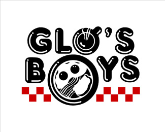
advertisment
662

Girls Night Out

by Jeff Fisher LogoMotives • Uploaded: Jan. 08 '07
9a81b14919cd06f9b9c9c7ca5a8bfc01.png
2739

Description: This logo is for a theatrical production about a bachelorette party going to a male strip club. The design received a Silver in the Summit Creative Awards. It appears in The New Big Book of Logos, New Logo World (Japan), Letterhead and Logo Design 7, and Logos from North to South America (Spain).

As seen on: bLog-oMotives

Status: Nothing set

Commenting: Not seeking critique, comments fine

Tags: theatertheatreblog-omotiveslogomotivesjeff fisher

More from this user:

badass sasquatch said on Mar. 05 '07

another gay logo. way to go homo.

Jeff Fisher LogoMotives said on Mar. 05 '07

As a gay man I personally find your comment very offensive - and totally inappropriate as it is in no way related to the design content of the logo in question or the LogoPond site.

artsyambie6 said on Mar. 09 '07

i dont think this is gay at all! i love the cross hatching on the u. it really draws my eye in and not just because of the content. i cant believe anyone would make such an obtuse comment... we should all be professionals here. regardless, im glad you stood your ground so well!

daleharris said on Mar. 09 '07

badass sasquatch, your offensive comments have no place in this century let alone what should be a professional discussion of logo design. maybe when you have the balls to post some of your own work we can extend you the same courtesy you SHOULD be showing jeff.

Jeff Fisher LogoMotives said on Mar. 13 '07

Thanks artsyambie6 and dale. I appreciate your comments and support.

OcularInk said on Mar. 13 '07

This badass guy has been posting nonsense comments like this all over the site. We all would love to see your work. :-P Jeff, I always love your concepts!! My only crit on this one, is the way the underwear is executed. To me, it looks a little bulky in the crotch area to be women's underwear. Even so, I like your cross hatching technique on this one.

OcularInk said on Mar. 13 '07

Okay, please ignore my last comment in regards to the underwear. I just realized that is the entire point. LOL!!

Jeff Fisher LogoMotives said on Mar. 13 '07

Ocularink - That's hilarious! Maybe I should have made an even bigger "bulge" to make it more evident. :o)

senterbrands said on Mar. 13 '07

It would have been cool to have a gradual crosshatch in the center of the crotch fading upwards....cough...camel...cough!! :) Nice one Jeff! I have always liked you techniques man, You Rock!

artsyambie6 said on Mar. 16 '07

jeff, you definitely should have made a bigger bulge. its not a bachelorette party unless someone gets an eye poked out. wait did i just say that? LOL

OcularInk said on Aug. 27 '09

HAHA, I feel like such a moron now. Perhaps it should be bigger. LOL!

Please login/register to make a comment, registration is easy,

Logopond Book V1 - PreSale Now!