advertisment
1218

kaimere

by kaimere • Uploaded: Jan. 08 '07
Gallerized Apr. '07 39fc1e436c8e1e72e9c28e2f902ba931.png
10315

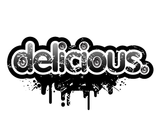
Description: ponder ponder ponder...

Status: Nothing set

Commenting: Not seeking critique, comments fine

Tags: personal logo

More from this user:

daleharris said on Jan. 08 '07

man i love this so much.

OcularInk said on Jan. 08 '07

Unique approach, Kaimere. I like this very much. My only complaint is the value of 'sketches. creation. realisation'. I think it could be darker. Even so, nice job.

kaimere said on Jan. 08 '07

Still working on never noticed it but has always been a subconscious signature when i have scanned in the sketches for presentations ... still wondering if the K is toooooo big

OcularInk said on Jan. 09 '07

Ya know, I didn't say anything, but the 'K' could come down in size as well. I almost want to see a little bit of white space within the 'K' too (i.e. where it loops). ;)

kaimere said on Jan. 11 '07

nice suggestion ... pondered about it but looked at it too long .. thanks bro...

halfstring said on Jan. 25 '07

Something pretty cool going on here. You should keep going with this direction. What about the "K" as a mark?

halfstring said on Jan. 25 '07

Something pretty cool going on here. You should keep going with this direction. What about the K as a mark?

kaimere said on Feb. 01 '07

think a lil bit of refinement needed ... but want it to look rough and off key ... who says perfection is perfection

nido said on Apr. 10 '07

i say perfection is perfection! this is perfect the way it is.

kult house said on Apr. 10 '07

I'd lose the scribble effect completely.

kaimere said on Apr. 10 '07

thanks kult house ... care to elaborate

kult house said on Apr. 10 '07

It's a nice signature, and I think taking the simple route of using a black ink approach would convey more class and confidence in your name as an identity. I'm not entirely crazy about the fact that it's angled downward.

kaimere said on Apr. 11 '07

but then surely the black ink approach is almost predictable tis an interpretation much like the e on your personal logo ... except less ominous but nonetheless conveys a point .

kult house said on Apr. 11 '07

I understand your sentiment, but the scribbled-text look is something I've never looked highly upon. Many logos from the cheesy days of the early 90's utilized that scribbled/chalkboard look and I immediately associate your logo with it; the only saving grace is the typography, which I really enjoy.

kaimere said on Apr. 11 '07

harsh comments my soon i understand your sensibilities be interested to see these cheesy logos ... cause none come to mind ...

kaimere said on Apr. 11 '07

damn the typos...harsh comments my son i understand your sensibilities be interested to see these cheesy logos ... cause none come to mind ...

nido said on Apr. 11 '07

lol 'my soon' lol

kaimere said on Apr. 11 '07

:p

kult house said on Apr. 11 '07

I don't mean to be harsh, just giving you my honest opinion about the scribble look. ;]

kaimere said on Apr. 11 '07

lol no ... is cool always keen to learn more ... :) hehehe ... i think its down to different perceptions ... the predecessors before us all have got us to where we are, im kinda protective over the cheesy old guys ... there logos stood the test of time in some cases only to be replaced by logos updated more times than we change socks

mas78 said on Apr. 12 '07

I like it very much, I think the idea and the graphic approach works perfectly. The only doubt that I have is about the down right direction.... it's not progresive... it feels like heavy.

attyl said on Apr. 13 '07

kult house is such an bright side of life guy. anyhow the mark is excellent, I love how things that look so pretty on a sketch pad and don't always apply to anything "usable" that can really be critiqued. this is that.

kaimere said on Apr. 14 '07

Thanks i think :)

waltermurray said on Jun. 05 '07

This is hot man:} respect to the max

s7even said on Jun. 29 '07

very nice, love the script, reinforces the tag, feels nice and organic, perfectly imperfect. ps. is the downward slant intentional?

kaimere said on Jul. 02 '07

Thanks dude... intentional or subliminal not sure ...how i have always written so seemed natural ... let the pyschoanalysis begin

sosfactory said on Jul. 19 '07

Hey mate, thanks a lot for your kind words. I specially like this logo, keep it up ;)

hindmarshdesign said on Aug. 27 '08

I love the sketchyness

muhanadhachem said on Aug. 28 '08

ponder ponder ponder...I Like I Like ...... Master.

kaimere said on Aug. 29 '08

thanks guys .. heheh muhanad the master is leigh :)

Please login/register to make a comment, registration is easy,

Logopond Book V1 - PreSale Now!