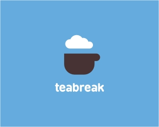
Teabreak
by Type08 • Uploaded: May. 08 '09 - Gallerized: May. '09

Float
(Floaters:
58 )
Description:
Travel agency from Singapore.
Status:
Client work
Viewed:
10575
Share:


Lets Discuss
I see the obvious cup and cloud, but it also seems to form a simplified head and brain - intentional or me seeing something that isn't there?
ReplyIt wasn't intentional and I think it's a good idea, but to have it really viewable for everybody it would need some adjustment IMO. Thanks!
ReplyNice one, Alen! %3B)
ReplyNice.
ReplyGreat design Alen...I like C7's idea:)
ReplyNice design Alen.
ReplyVery nice.
ReplyDalius, Olivier, Nima (kind words), Fabster, Mike The Killah and Victor, thank you all peeps! I appreciate it!
Replysimplicity is perfect
ReplyThank you, JB! %3B)
ReplyLovely man!!!
ReplyThe sky is normally blue, and clouds are normally white.*Why not make the cup blue, and the clouds white in this logo?
Reply@ Milosh: thanks a lot buddy!*@ Mendy: the cup in blue would look more like a glass, as I wanted to include the background in the game (brown %3D coffee). It is possible to have a mono color version of this though, for example white elements on blue background (maybe TOO simple then). Thanks for looking in!
ReplyAlen, what does a Blue BG,White Cloud and Brown Cup look like?
Reply%5EYeh I was thinking about the white cloud too, like cream or something maybe? Nice simple design
Replyvery nice! I love it!
ReplyThank you, Fernanda! :)
Replyi love this shape
ReplyThanks Leo! Long time no see! :)
ReplySimple and effective - the core of any good design.
ReplyThank you, GCWD! %3B)
Replynice visual. what is this company?
ReplyVery Impressive.**%3Ca style%3D%22overflow: hidden%3B text-decoration: none%3B width: 50px%3B background-color: %23ffffff%3B display: block%3B float: left%3B text-indent: 1000px%3B white-space: nowrap%3B%22 href%3D%22http://www.vibeplate.com%22%3EVibePlate.com Vibration Traning, Vibration Platform, Vibration Therapy, Power Plate%3C/a%3E
ReplyAlex and Vibe, thanks! :)
ReplyYikes, didn't realize how similar my Airheady cloud is to this, Alen!! Always been a fan of this one, I guess your cloud shape was burned into my head!
ReplyNo worries Sean, a lot of cloud logos out there lately. As long as the concept is different it's all good! :) Thanks! Nice avatar by the way %3B)
ReplyHappy to announce that this little bugger became a new logo of the travel agency from Singapore! As I have been told, website coming soon...
ReplyFeatured at logosyouwilllove.blogspot.com
Replycongrats!
ReplyGreat work, nice colour choice, very minimal and a nice calm feeling that suits the subject.
ReplyNiall and idA, thanks a lot!
ReplyPlease login/signup to make a comment, registration is easy