Wine Bottega
by AlphabetArmDesign • Uploaded: May. 04 '09 - Gallerized: May. '10
Description:
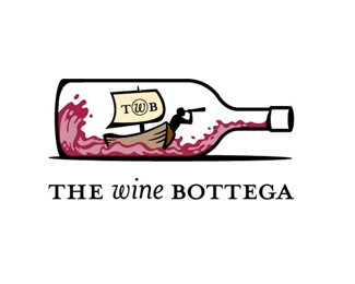
We created this new identity for a swanky, upscale wine shop in Boston’s North End. Our client wanted an unexpected logo that could stand apart from the formal aesthetic of many wine store competitors. The Explorer within the wine bottle has inspired the theme of a wine adventure throughout the marketing materials, tagline and signage.
As seen on:
Status:
Client work
Viewed:
13364
Share:



Lets Discuss
Very nicely done. The only thing I'd do is drop the lettering from the sail.
Replyi agree with cseven, but i love the mark. awesome job! :)
Replyyeah drop the letters
Replythe letters on the sail need not necessarily be dropped, but maybe hand rendered so they don't look so out of place on the awesome handdrawn illustration.
Replythis is very, very good!
ReplyFun stuff! Great style! :)
Replyawesome illustration! I agree about the sail tho :)
ReplyGREAT. i agree with others. lettering on ship makes it look cluttered.
ReplyFun idea but might be too many details for a logo.
Reply%5E tending to agree! feel there are too many elements and colours in the logo!
Replyfantastic illustration here!
Replyi love the illustration
ReplyInteresting way of standing out in a crowd. Like your thinking here.
Replyfantastic work! keep it up!
Replyawesome
ReplyThanks for the compliments guys (and ladies)!
ReplyPlease login/signup to make a comment, registration is easy