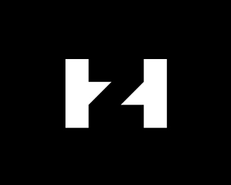
HZ
by janzabransky • Uploaded: Apr. 28 '09
As seen on:
Dribbble (2011 version)
Status:
Unused proposal
Viewed:
15281
Share:
Lets Discuss
good mark, the subtext is a little too wide from the headline imo, and the little thingy's on those letters dont work anymore on that subtext. But the mark i like :D
ReplyThank You T%F8mme
ReplyUPDATE: I have cut off %22Attorney at Law Office%22 subtext under headline-name. T%F8mmes notice was pointfull. It is unnecessary add that to logo.
ReplyJan, the H is too wide and it is hard to recognize as such because of that.
Replyepsilon: I tried to make H and Z into square format ... make H not so wide, but it didnt looks better ... On the other side H is first letter of surname, so I think it is quite important that is wider than Z and dominant over Z. Thank You and others for your input and time You dedicate to my work. I appreciate it.
ReplyHave you tried overlapping them. I.e. take a square and fill it with both H and Z, then have a look at the areas that intersect and see if they can be used to build a recognizable H/Z combination mark ...
Replyit needs work on type*mark is EXCELLENT.
ReplyUPDATE: I add dark red color to mark ang changed font (thanks Cris for a tip). I think this color works well with law direction of firm. Selected font: Helvetica Condensed is classic and modern and works good with this branch, too. Epsilon: I tried do, what You recommended to me - overlapping and intersecting brings a shape that took away simplicity of a mark in my opinion. I think this step would not increase readibility HZ letters combination. I want to keep mark this simple geometric way. I am convinced it is clear for people to find monogram letters in a logo. I asked for evaluate this couple of friends and it takes them few seconds to find both letters, after that they were surprised and they liked idea. Thank you guys for helping me.
ReplyUPDATE: changed type to Optima
ReplyHey Jan, just saw this while doing a search. If I'm not mistaken, this mark is exactly like the Inmetro logo flipped on it's side.
ReplyOhhhh I was shockes when I saw it, You are absolutely right, its the same idea just rotated by 90 degrees. Almost same shape in negative space usage, but totally diferent content %22IN%22 vs %22HZ%22 letters. What a coincidence!! I must say it works very good as identity :-) Great find Kev.
ReplyI like it :)**remind me the INmetro logo:**http://1.bp.blogspot.com/_sjX51bjYiMA/SAwINFQe_DI/AAAAAAAADjM/XOs1mQaVYZY/s400/inmetro.JPG
Reply%22Now is the time for all good men to come to the aid of their Logopond%22
Reply2011 evolution: http://dribbble.com/shots/324216-HZ
Replynow that I know the other one ... it's hard to fall in love with this ... but ... good work !!
Reply:-) thanks buddy
ReplyPlease login/signup to make a comment, registration is easy