TurnLeft
by Siah-Design • Uploaded: Apr. 24 '09 - Gallerized: Apr. '09
Description:
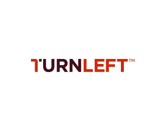
A wordmark proposal for TurnLeft - A marketing and consulting business.
Copyright Josiah Jost and Siah Design © 2009
Status:
Client work
Viewed:
20233
Share:




Lets Discuss
O yeah! I like the idea a lot Siah!
ReplyHey Alen! Thanks!
Replylove the concept! really good. maybe round the 'L' in left too.
ReplyGreat concept. May be a little less white space between the turn and the rest of the T?
Replyclever !!!!
ReplyThis would go awesome on a letterhead if you rotated it 90 degrees. ie. The person has to tilt their head to the left to read the text. I used the same technique on a book cover here:*http://justcreativedesign.com/wp-content/gallery/print-design/photoshop-for-right-brainers-book.jpg*(notice you have to tilt your head to the right to read it?**Good job :)*
ReplyLove it, Siah!
ReplyVery nice!
Replygreat idea. . . JustCreativeDesign. I think that'd really push the work.
Replywill keep %22turn-ing back%22 to it
Replyyup like i said, this one would be the strongest, hope they pick it! - good job bro
ReplyThis is great!
ReplyHey thanks everyone!**@Climax: Thanks for the comment and the FP spot! Good eye with the %22urn %3D earn%22! :)**@Lawrence: I did experiment with the white space between the turn and the rest of the T and I felt it needed that much space for when the logo is scaled down in size.**@JustCreative Design: Hey great idea, Jacob! If I get the chance I'll present that to the client.
ReplyOh yeah don't forget Jacob, he has to get his plug in there somehow.
ReplyBTW, FWIW, nice job Siah.
ReplyYou haven’t Left the right Turn %3B)
ReplyYou have not Left the right Turn %3B)
ReplyI mean you made a correct(right) turn...Creative! :))
Replynice play with type.%0D*It'll be good if u add an arrow, but that looks obvious.%0D*Try to add some element.%0D*%0D*It's just a suggestion.%0D*%0D*Nice work..
ReplyOK. Needs something though...
Replymaybe they are right about adding and arrow... i'm not sure but i think it needs a little something more. Even without something more it's still a great concept.
ReplyGreat concept. I don't think it needs a thing...
ReplyIt would be great if there's an arrow in the first %22T%22 pointing to left
ReplyThat's just perfect.
ReplyPlease login/signup to make a comment, registration is easy