Step To End Poverty
by Reghardt • Uploaded: Apr. 22 '09 - Gallerized: May. '10

Description:
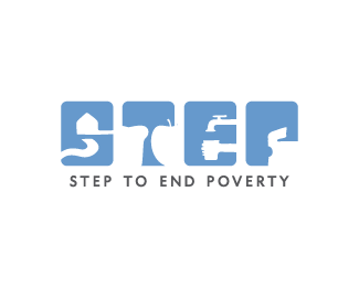
Unused Charity Logo, images show what when lacking causes poverty
Status:
Nothing set
Viewed:
17041
Share:


Lets Discuss
I don't get the last one, the P, what's inside it?
ReplyI think that is a t-shirt
Replyyea, the last one is suppose to show clothing
ReplyGreat solution with typography.
ReplyPity it was unused, 'cos it works really well.
Replylike it, Reghardt. great concept. it suppose to make people think, and it does.
Replylooks great.. I would flip the t-shirt clockwise so its straight..it kind of hard to make out at that angle.
ReplyYea, brilliant concept. It works so well%3B I'm surprised it wasn't used.
Replynice! love it,
Replywow, that's great! is the one with the apple a slice of bread? i really like it though.
ReplyCool stuff, never seen anything like it.
ReplyThanks Guys, maybe i can find another use for it :P**@birofunk cool will have a look
ReplyVery, very cool!
ReplyI read STEF
ReplyI love it! It's original, fun and yet it's serious. **
Replylove the idea!!! it's so original...
ReplyYea....This is so AWESOME!!!!
ReplyHey Reghardt we setting up a Worker Coop in Cape Town we like your Logo,could we buy it as it encapsulates exactly what we looking to achieve with the Coop ie.lift people out of poverty,contact me [email protected]p
ReplyPlease login/signup to make a comment, registration is easy